MEMU™mini maker Redefining MENU
Exploring the History, Function, and Responsibilities of Menus
Introduction
In the process of business development, numerous actions often go unrecorded in formal literature, yet their significance and value should not be overlooked. This article aims to redefine the concept of “MENU” by exploring its history, functions, and responsibilities, while emphasizing the evolution of menus in different eras and industries. Furthermore, we will discuss some modern business practices, with a particular focus on “checklist menus,” and how business owners should shoulder the responsibility of ensuring the effectiveness and clarity of menus.
I. The Historical Origins of Menus
The history of menus can be traced back to ancient times when businesses used various materials and presentation methods to provide customers with information for making choices. Initially, merchants would create signage on walls, serving as reference tools for pre-transaction decision-making. However, these wall signs had limited utility when dealing with a large number of customers or those with poor eyesight.
To address this challenge, businesses started using lighter materials like animal hides or bamboo, providing customers with a close-up reading experience. The early menus may have been as simple as a natural material placard, but over time, they evolved into various forms such as booklets or boxes. Additionally, in ancient times, animal skin-carved scrolls were also widely used, often in diplomatic missions or royal commissions, serving as tools for passage or authorization.
These diverse materials and presentation methods underscore the historical origins and significance of menus. They demonstrate that the use of menus has a long history and has evolved and innovated over time.
II. The Functions of Menus
In recent times, with the invention of paper and the proliferation of printing technology, menus have become a common business tool with multiple functions. Beyond conveying food or product information, menus serve other roles, such as recording orders, calculating prices, and providing service recommendations. Additionally, menus can be employed for business strategies, including price positioning, product promotion, and improving customer experiences. As the business landscape continuously evolves, the functions of menus also adapt and expand to meet the needs of various industries.
III. The Responsibilities of Menus
As a business tool, menus should come with a certain level of responsibility on the part of the owner to ensure their effectiveness and clarity. In modern business practices, there is a common tool known as the “checklist menu.” While it differs from the traditional definition of a menu, it holds unique functions and value. Checklist menus are typically used to record and convey information related to processing, handling, accounting, billing, inventory, and more. However, some owners may directly provide checklist menus to customers as menus, which can lead to confusion or mistakes.
To ensure the clarity of menus and customer satisfaction, owners should take the following measures:
- Provide a detailed explanation of the contents of a checklist menu, particularly focusing on product descriptions, pricing, and specification information.
- Communicate with the customer and repeat the menu content to confirm, in order to prevent misunderstandings or omissions.
- Offer assistance and recommendations to customers in their choices to ensure they can make informed decisions.
Summarize
The history and functions of menus play a significant role in the business world. They not only provide product information but also serve multiple functions, including order recording and business strategy. Owners should recognize their responsibility towards menus, ensuring their effectiveness and clarity to provide a better customer experience and drive business results. While menus may have evolved over thousands of years, they remain an integral part of modern commerce, requiring continuous adaptation and innovation.
Real experiences and feelings
We should never rely on the cold screen of a digital electronic menu to perfectly replace the tangible, real menu, as in this world full of emotions and artistic charm, there exists an irreplaceable magical connection between them: the interaction between people.
Think about it, when you walk into a restaurant or cafe, holding a physical menu book in your hand, there’s a tactile and immersive experience that electronic screens can’t replicate. The tangible presence of the menu book allows you to feel its weight, touch its texture, creating an intangible emotional connection. Every moment you flip through its pages is like the prelude to a visual feast, and each item description guides you into a culinary journey like poetic verses. This tactile and emotional experience is something that digitalization cannot replicate.
For aficionados of the arts and culture, a menu book is a piece of artwork that showcases personality and taste. It’s not merely a collection of words and images on paper, but a unique design work that reflects the style and philosophy of the restaurant or café. Every choice of font, every placement of an illustration, encapsulates the design inspiration and creativity of the restaurant owner. This artistic menu design adds an element of fun and anticipation to dining. It’s not just a tool for ordering, but rather a piece of art, a collectible masterpiece in its own right.
Furthermore, physical menu books can also evoke memories and emotions. Imagine that you’ve had a special moment in a particular restaurant, perhaps a romantic date or an important celebration. That menu book becomes a witness to that moment, with every word and sentence carrying your memories and emotions. Digital electronic menus struggle to reach this deep emotional connection because they are merely cold, data-driven interfaces, lacking the soulful essence of a physical object.
In summary, a physical menu book is more than just an ordering tool; it’s a piece of art infused with emotions, memories, and cultural flair. Whether it’s the tactile experience, the design, or the emotional connection, digitalization falls short in comparison. Therefore, don’t expect digital menus to completely replace the authenticity of a physical menu book. In the world of culture and aesthetics, they possess irreplaceable unique value. Let’s continue to savor the distinctive charm brought by physical menu books and let the cultural flair continue to blossom in our lives.
Formosa Taiwan

Banner Menu History
double sided menu or single sided menu
Ancient Natural Materials:
The Varied Aspects of Communication, Exchange, and Trade
The diversity of communication, exchange, and trade methods in ancient times is truly remarkable. In the civilizations of the past, people relied not only on language but also utilized a variety of natural materials such as oracle bones, stones, clay tablets, wooden planks, bamboo strips, animal bones, animal skins, teeth, and even grass, which played crucial roles in different aspects of their societies.
Firstly, oracle bones were used as a writing material during the Shang and Western Zhou periods. People inscribed events, transactions, and religious rituals on turtle shells and animal bones. The interpretation of these oracle bone inscriptions not only provides important insights into the society, economy, and culture of that time but also helps us understand the cultural and historical developments of that era.
Furthermore, stones and clay tablets were extensively employed for information exchange and trade. In ancient Egypt, people inscribed messages on massive stone monuments, which became historical records documenting proclamations, achievements, and laws of the time. In ancient Babylon, clay tablets were the primary writing material, recording commercial contracts, legal texts, and religious rituals. These records were not only circulated locally but also served as a medium for international trade, facilitating communication between ancient civilizations.
Wooden planks and bamboo strips played significant roles in ancient writing and communication. In Mesopotamia, they used wooden planks as writing boards to inscribe information, aiding in the preservation and dissemination of knowledge. On the other hand, bamboo strips were commonly used by ancient scholars for document writing, especially during the Warring States period in 475 BC. These bamboo slips contained a wealth of literary, philosophical, and historical information.
In addition, animal bones, animal skins, and teeth played unique roles in ancient communication and trade. Ancient hunters and tribes used animal bones and hides to craft tools, ornaments, and trade goods, reflecting the local resource utilization and playing a critical role in trade. Teeth were often used in making jewelry and handicrafts, serving as valuable exchange items.
Lastly, grass was widely used for ancient writing and marking items. For instance, in ancient Egypt, papyrus, made from plant fibers, was used for writing and recording important information. Similarly, in the collection of artifacts in the Taipei National Palace Museum, there are extensive cursive script inscriptions on silk and bamboo strips. These documents hold significant value in the study of ancient societies, cultures, and sciences.
In conclusion, the diversity of ancient methods of communication, exchange, and trade highlights the embodiment of human creativity and wisdom. These natural materials were not only used for the exchange of goods but also played an indispensable role in communication and trade. They also served as crucial tools for marking and identifying items, providing us with invaluable and enduring records for understanding human civilization.
「匾額 Banner」
Classic Advertisements in Ancient Commercial Activities
The diverse use of natural materials in ancient communication, exchange, and trading methods not only reflects the limits of human creativity at that time but also leaves intriguing clues in the evolution of culture and language. One of the most representative applications of such materials is the 「匾額 Banner」 a widely used form of storefront advertising in these commercial activities. The use of this form can be traced back to ancient Shanxi around 205 AD, providing us with interesting observations about the business culture and language development of that era.
First, it’s worth noting the apparent similarities between the English word 「Banner」 and certain words in ancient Shanxi. These resemblances might not be mere coincidences but could reflect historical linguistic connections. Such connections can be traced back to ancient cultural exchanges and business ties, especially in trade activities. Merchants and traders may have used similar terminology and symbols to identify and promote their goods and disseminate information between different regions.
Furthermore, we can consider whether there is some connection between 「Banner」 and 「MENU」 While these two words may seem different in form and meaning, they both pertain to commercial activities and product promotion. 「Banner」 typically refers to a banner or sign used to display a store’s name, logo, and special promotions. Conversely, 「MENU」 is a list of food and drink options offered by a restaurant or bar. However, both terms are designed to capture people’s attention and encourage them to make a choice, whether it’s entering a store or placing an order.
In this sense, 「Banner」 and 「MENU」 can both be seen as forms of commercial advertising aimed at attracting customers and prompting them to engage in transactions or purchase products. The origin of this advertising form may be related to the business activities and exchanges in ancient Shanxi and has evolved over time into the forms we are familiar with today. Therefore, we can say that there is some degree of association between 「Banner」 and “MENU,” as they both represent a way of business promotion and communication, reflecting the evolution of business culture and language.
The Origin of Menus:
The Confluence of Diverse Cultures in Ancient Taiwan
The diversity of cultures and history in Taiwan can be traced back to around 960 AD when this land had already become a place where different cultures converged. During this period, even though the dining options at the time might have been recorded on rudimentary pieces of parchment or wooden boards, these food lists gave rise to the unique Taiwanese terms we are familiar with today, namely 「菜單」or「菜牌」 which translate to “menu.”
While these terms lacked formal written records at the time, we can gain a deeper understanding of this history through museum artifacts. It’s worth noting that this report will focus on 「菜單」or「菜牌」 and not to be confused with 「菜谱」 or 「餐单」
Firstly, the existence of 「菜單」or「菜牌」 reflects the diversity of dining habits during that time, a diversity that can be traced back to interactions and exchanges among different cultures. Taiwan, being a cultural crossroads, attracted immigrants and merchants from various regions, bringing with them a variety of ingredients and culinary techniques. Thus, these menus served not only as lists of food names but as records of culture and history, reflecting the societal structure and way of life of that time. Despite the lack of formal written records, museum artifacts can provide valuable insights. For instance, well-preserved ancient stone tablets or wooden boards may be inscribed with food names and prices from that era, and these artifacts can be considered as a form of ancient “menu.” Through the study and interpretation of these exhibits, we can gain insights into the dining habits, business culture, and societal structure of that time.
In summary, Taiwan’s early history of multiculturalism contributed to the diversity in local dining habits, which is reflected in the 「菜單」or「菜牌」 of the time. Although these terms might lack formal written records, museum artifacts provide an opportunity for us to delve into this history and understand the culture, society, and dining practices of ancient Taiwan.
The Etymology of
「銀行 Bank 貝殼」
The Connection Between Natural Materials and Ancient Civilizations
Let’s take the term「銀行 Bank 貝殼」as an example to explore the crucial role that ancient Taiwan played in the fields of trade and communication. Despite the striking phonetic similarity to「來自台灣的寶螺:貝殼」(Cowrie shells from Taiwan, related to the Gift Economy), we do not intend to delve into the realm of monetary economics. However, this example serves as a reminder that Taiwan played a vital role in trade and communication during ancient times, attracting traders from around the world.
First and foremost, the phonetic similarity of the term「銀行 Bank 貝殼 」may reflect the unique status of ancient Taiwan in trade. Ancient trade activities often involved a variety of exchange mediums, and the Cowrie shells from Taiwan served as a natural exchange tool widely used in trade worldwide. In particular, “Monetaria moneta,” a type of Cowrie shell originating from Taiwan, was prevalent in the warm waters of the Pacific and Indian Oceans and was extensively utilized as a trade medium. Taiwan’s strategic location within the Asia-Pacific region, along with its natural resources, made it a pivotal hub for Cowrie shell trading, further enticing traders from various regions to venture into the area. Taiwan’s geographical position during ancient times made it a crucial trading bridge between Southeast Asia and East Asia. In this context, the phonetic similarity of「銀行 Bank 貝殼」might reflect the exchanges and interactions between different cultures and languages, fostering trade and cultural exchanges.
In summary, the phonetic resemblance of the term「銀行 Bank 貝殼」to「來自台灣的寶螺:貝殼」serves as a reminder that ancient Taiwan played a key role in trade and exchange. Its geographic location and natural resources attracted traders from around the world, facilitating interactions between various cultures and languages and enriching Taiwan’s cultural diversity. This historical context provides profound insights into Taiwan’s multicultural heritage and trade history. If we were to establish a rough timeframe, it can be traced back to around 1600-1900 BCE, during the Xia and Shang Dynasties. Ancient Egypt, at that time, had not yet developed the use of currency and was in close proximity to the Indian Ocean, even sharing a land connection with it, yet did not adopt Cowrie shells as a trade medium, as evidenced by the aforementioned discussion.
The article introduces an intriguing perspective by attempting to explore the role of ancient Taiwan in trade and communication through the comparison of linguistic similarities. However, this viewpoint raises some questions and assumptions that require further examination and evidence to support or confirm.
- Linguistic similarities can be fascinating, but establishing a direct relationship between two words based solely on phonetic resemblance is a complex matter. Language evolution is a multifaceted process, and phonetic similarity alone is often insufficient to conclusively demonstrate a connection between two words. In-depth linguistic research, etymological analysis, and historical context are typically needed to determine the true origins and relationships between words. The article’s observation serves as a starting point for further investigation, but it should be treated as a hypothesis rather than a proven historical fact.
- The article’s assertion about Taiwan’s role in ancient trade, driven by its geographic location and natural resources, certainly needs further substantiation through historical evidence. Ancient trade is indeed a complex phenomenon influenced by a multitude of factors, including political, economic, and cultural elements. While linguistic similarities between individual words can be interesting, they may not provide a comprehensive explanation for the entire trade system’s operation. To fully understand Taiwan’s historical role in trade, a holistic approach that considers various historical, archaeological, and anthropological sources is essential.
- The article mentions that ancient Egypt did not develop the use of currency but does not provide specific historical evidence to support this claim. The issue of currency usage in ancient Egypt can indeed be quite complex and may have varied across different periods and regions. To establish the historical accuracy of such claims, further research and evidence are necessary to examine the evolution of trade systems and currency usage in ancient Egypt. It’s important to consider the broader historical context and archaeological findings to gain a comprehensive understanding of how trade and currency systems functioned in that region during various time periods.
In conclusion, this article presents an intriguing hypothesis, but it requires further research and evidence to establish the accuracy of its claims. Historical research often demands a multifaceted approach and comprehensive analysis to determine trade and cultural exchange patterns in specific time periods and regions. It’s important to reiterate that the article’s conclusion concerns the specific term in Taiwan,「菜單」which is related to a menu, and any broader implications should be approached with caution and supported by a rigorous examination of historical data and linguistic evidence.
The Evolution of Menus:
From Plaques on Walls to Handheld Reading
Through the evolution spanning many generations, we can trace back to before the year 960 AD and confirm that the objects hung on the walls of our establishments were, in fact, miniature versions of「Banner」 referred to as「菜牌」or「menu」This discovery reveals the historical roots of menus and their transformation in the dining experience. At that time, dining scenes were often crowded, and some individuals might have differences in visual acuity, making it more convenient to have menus to be read in hand. The concept of the「菜牌」was aimed at making it easier for customers to choose dishes while streamlining the ordering process. This design reflected the level of societal civilization at the time and emphasized providing convenient service during dining occasions.
However, with the continuous development of society, dining practices underwent significant changes. There was no longer a need for everyone to crowd together for ordering; instead, people could sit comfortably at their tables and select dishes. This transformation meant that menus no longer needed to be placed high on walls or other surfaces but could be placed on tables for guests to peruse. This change ultimately solidified the usage of the term「menu」as an integral part of restaurants and the dining experience.
In conclusion, as a tool for offering choices during the dining process, menus have evolved over many generations and societal changes, reflecting not only people’s need for convenience but also the evolution of dining culture. The rich and diverse historical roots of menus demonstrate the ongoing pursuit and improvement of the dining experience.
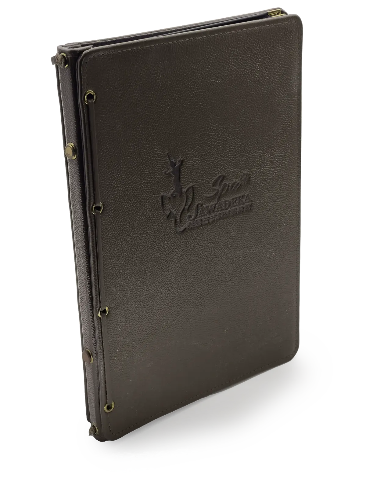
Material: Genuine leather, synthetic leather, functional fabric
Processing: Embossing, computer embroidery, engraving
Binding: Hard transparent sheet can be replaced
Inner page: General cultural paper.
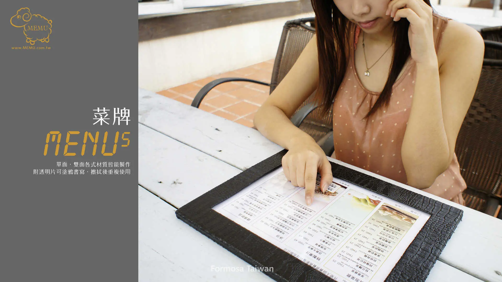
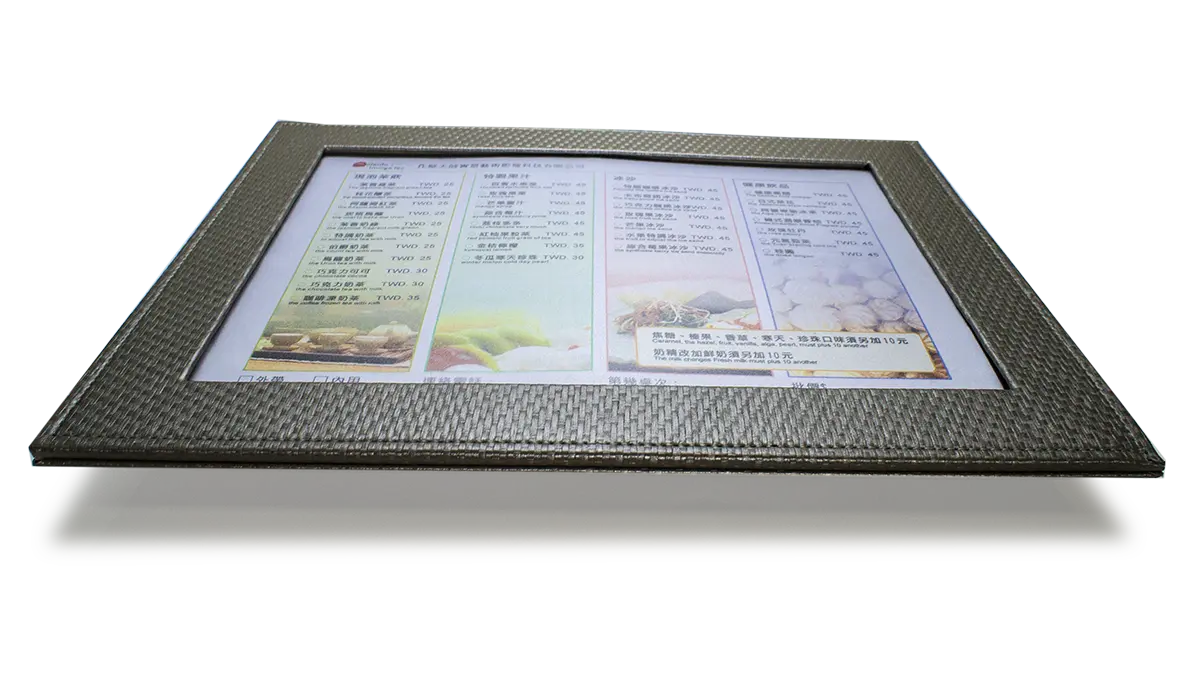
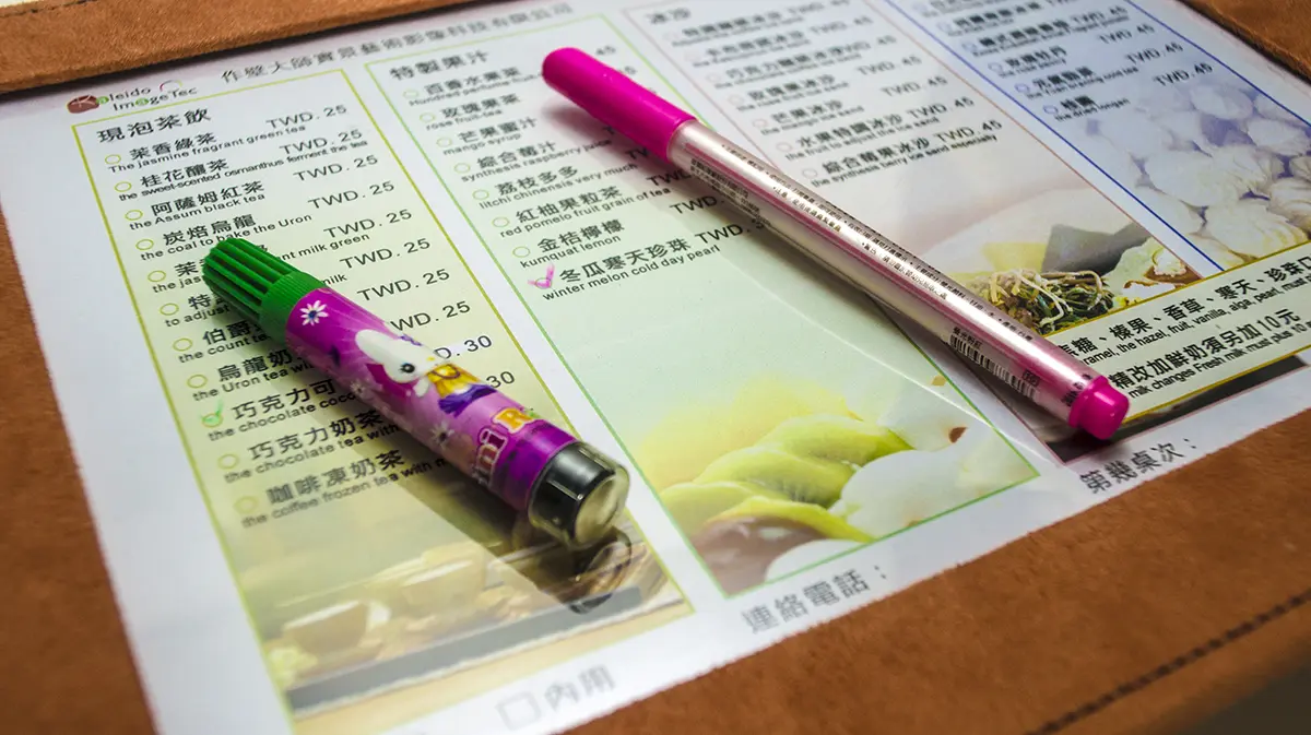
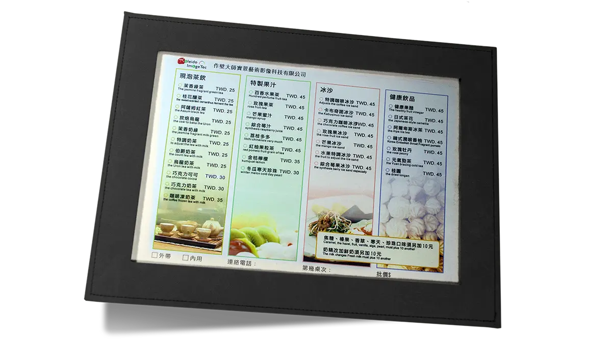
Our store offers an original product that allows for single or double-sided writing and replacement of inner pages. It can also be used as a checklist. The hard plastic sheet can be replaced to continue use with updated materials.
Image link: Banner #10
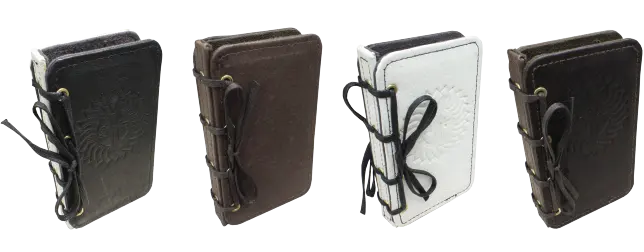
M. E. N. U. These four menu forms
When researching various forms of menus, we often inevitably come across the term 「MENU」But what exactly is a MENU?
Should we have a「菜谱」(recipe book) before we have a「MENU」or is it the other way around? This question has sparked intense debate on well-known online encyclopedias, and to this day, there is no definitive answer. However, for those who consider themselves traditionalists, this question is not complex, but rather an unnecessary controversy. In fact, the four letters「MENU」have long provided an answer, and perhaps delving deeper into it can make everything clearer.
First, we must understand the origin and definition of the term「MENU」
MENU was initially recorded in the French language and referred to a list of food and beverage options offered by a restaurant or eatery. In other words, a MENU is a guide that summarizes the food and drink choices available, allowing customers to make selections conveniently. According to this definition, the MENU is intended to provide a framework of choices, enabling customers to choose their meals based on personal preferences and needs. Therefore, the existence of a MENU does not depend on a recipe book but is an independent entity with the purpose of making ordering more convenient for customers.
In conclusion, the term「MENU」has already provided us with a clear answer, without the need for further debate. A MENU is a guide that offers options for food and beverages, and its existence is independent of whether a recipe book exists before or simultaneously. Its purpose is to simplify the dining process and empower customers to make choices. Whether a recipe book comes first or a MENU is established first, there is no need for intense debate. What matters is their complementary role in the dining experience, providing a variety of choices and convenience. The provided perspective is quite reasonable because these two elements can develop in parallel, with distinct functions. A「菜谱」(recipe book) typically provides detailed recipes and cooking instructions, while a 「MENU」 offers selection and pricing information to help customers make choices and place orders.
MENU first letter M.
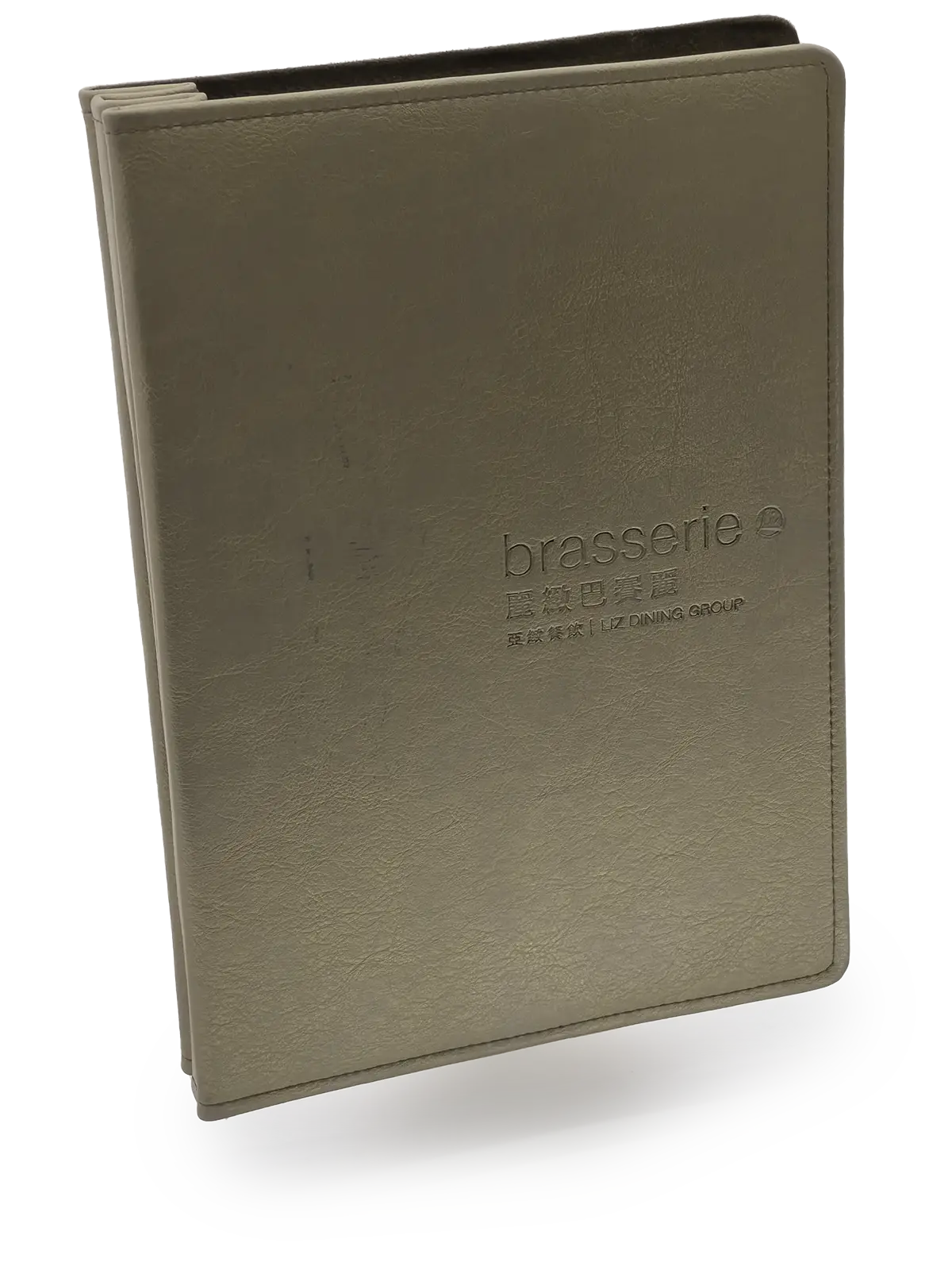
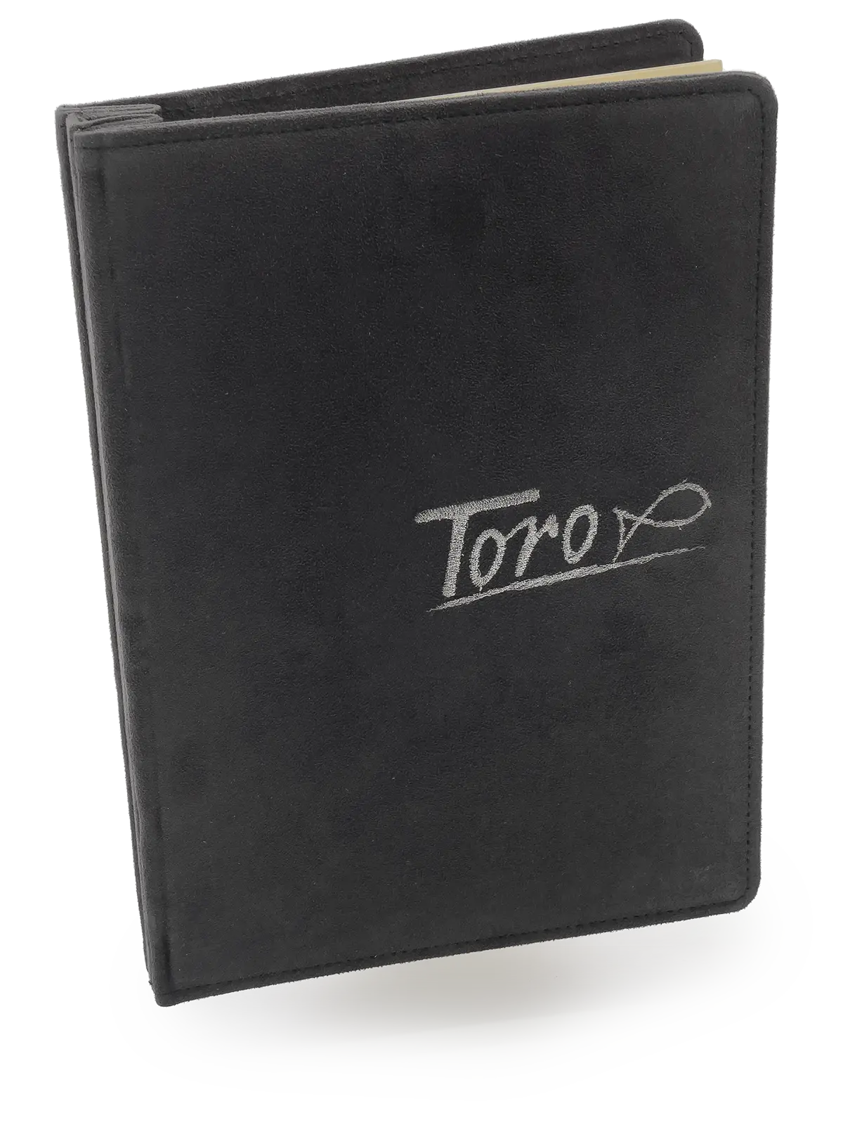
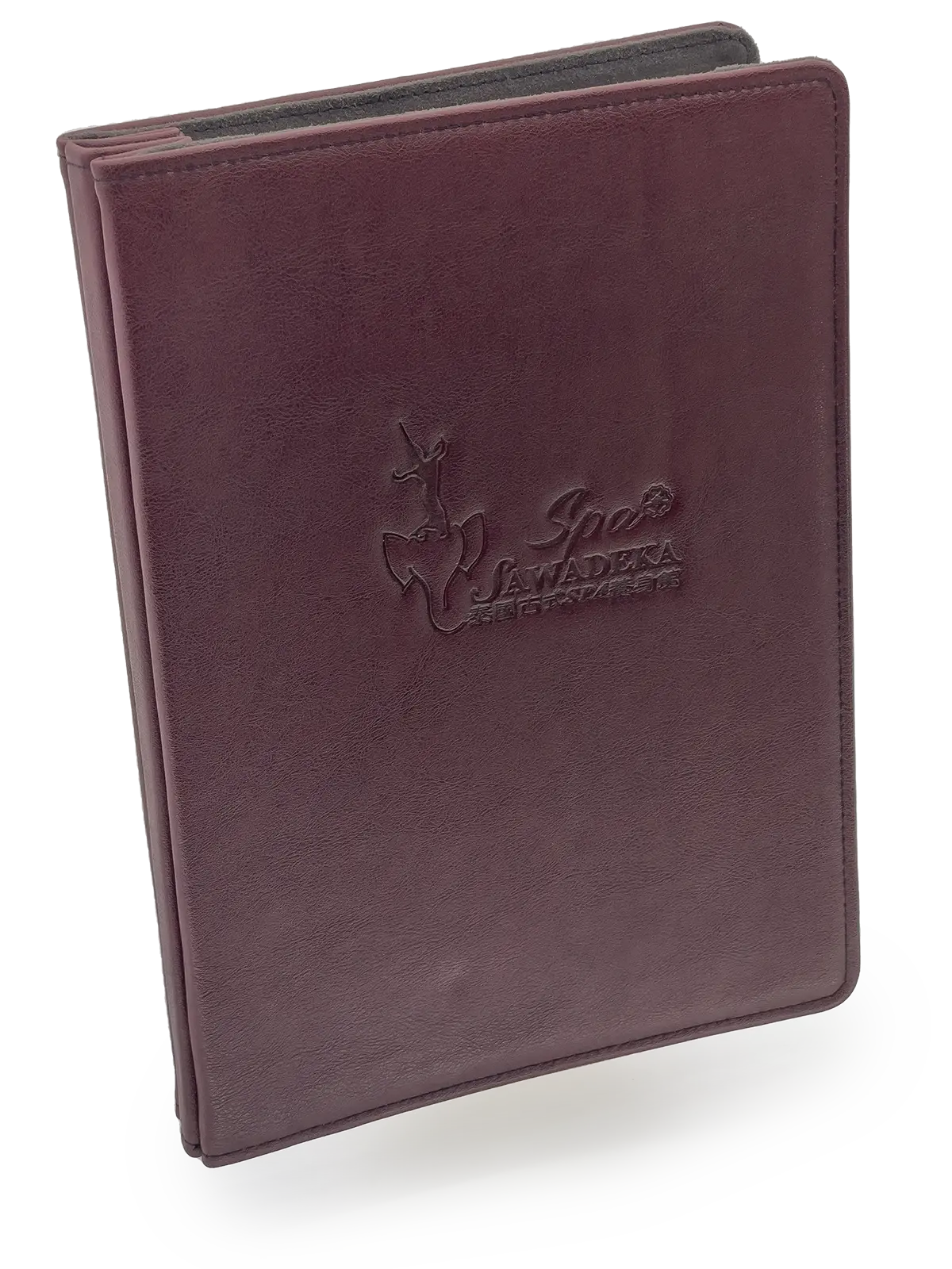
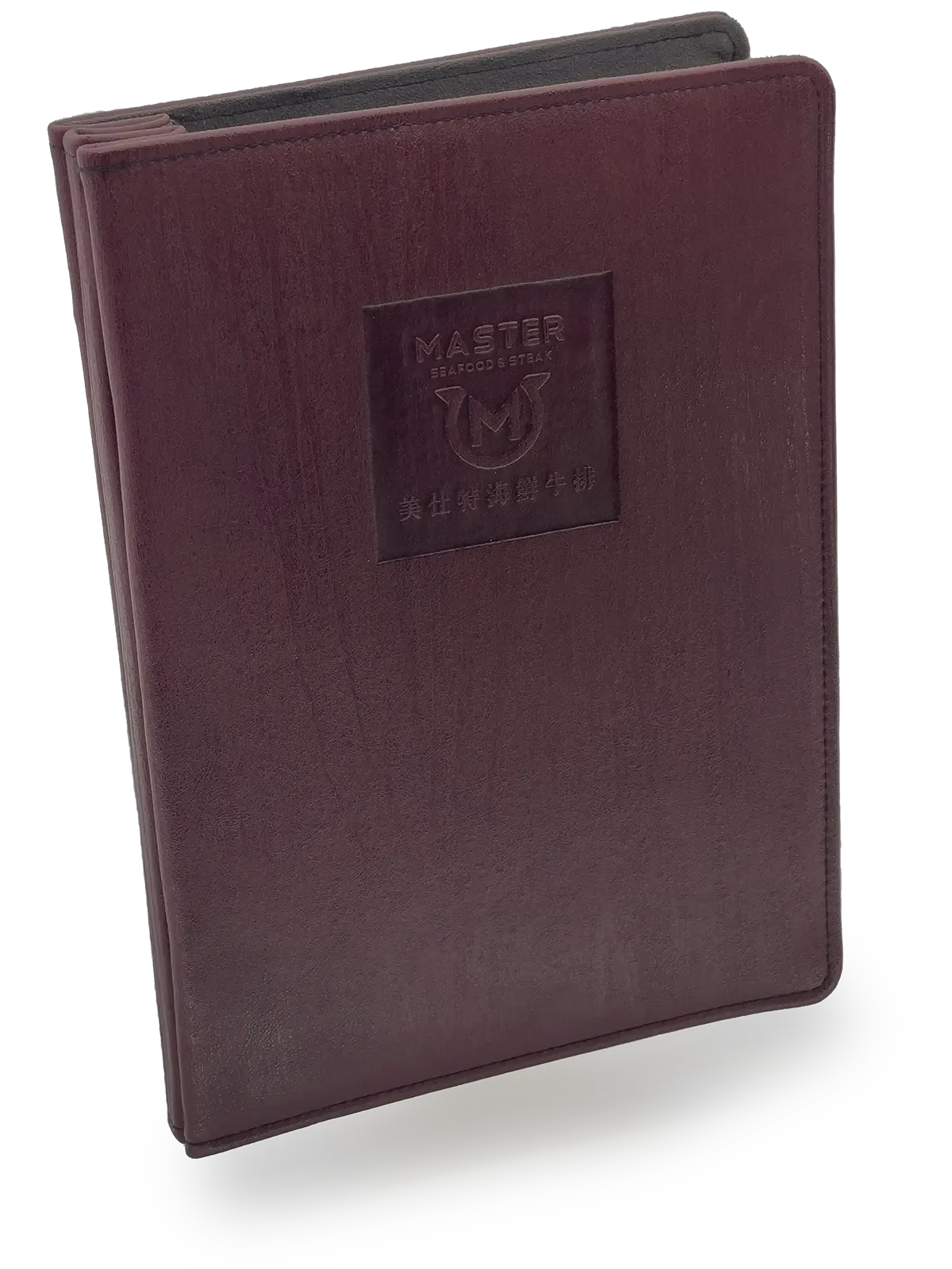
The M-shaped menu folder is constructed as a single unit with an M-shaped binding. This type of menu, named after the first letter「M」in the word「MENU」is known for its exceptionally refined appearance, making it a preferred choice for upscale restaurants due to its unique design and craftsmanship. In addition, we will delve into different interior page options and the advantages and limitations of this menu format.
Firstly, the M-shaped menu folder employs a double-fold binding technique, characterized by its appearance where you can’t see visible binding lines or staples, resulting in an exceptionally refined exterior. This impeccable craftsmanship gives the menu a certain thickness in the spine, providing customers with a higher-quality tactile experience. The design and appearance of this menu format are relatively substantial, adding a sense of value to the dining experience.
The M-shaped menu folder offers a variety of options for its double-fold binding interior pages, which can be adjusted according to the restaurant’s needs and budget. Here are several common interior page choices:
- Cardstock pages:Cardstock interior pages typically offer excellent texture and increased durability, making them well-suited for showcasing high-quality images and text descriptions. One key advantage is that they provide a satisfying page-turning experience, leaving you with a feeling that you won’t want to go back to any other option. Cardstock pages can provide menus with a premium and tactile feel, ultimately enhancing the overall dining experience.
- Art paper inner pages: Dreamy art paper typically features high-quality paper with a luxurious texture, making it ideal for menus that require an exceptionally refined and artistic design.
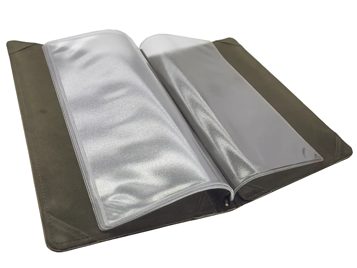
- Invincible menu inner page: Using special rigid PVC material, combined with environmentally friendly non-woven fabric, enhances the flexibility and durability of page-turning. The options of high gloss and diamond gloss make it suitable for long-term use in menu interior pages.
- American menu inside page: Utilizing special rigid PVC material, with options for high gloss and diamond gloss, these menu interior pages are a product of the 1940s, representing the pinnacle of high-end plastic material for menus.
- Inner pages color printed on ivory paper: Using 180-pound ivory paper for digital inkjet printing and illustrations, the surface can be coated with either gloss or matte finish. After the coating, it results in a thickness of approximately 220 pounds.
- PVC inner page rubber sleeve: Using flexible PVC material, processed through high-frequency heat treatment, with options for matte and glossy finishes.
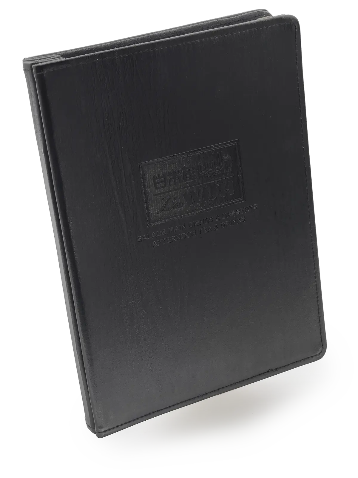
Additionally, there are more interior page application choices available to meet different needs and budgets. However, due to the weight of some materials, it’s recommended to keep the number of interior pages to around 8 to 24 pages to ensure the menu doesn’t become too heavy.
In conclusion, the M-shaped menu folder with double-fold binding is the preferred choice for upscale restaurants due to its refined appearance and a variety of interior page options. It offers a high-quality tactile experience and adds value to the dining experience. Different interior page choices provide flexibility to tailor the menu to the restaurant’s specific needs. Despite the limitations in spine thickness, this menu format has a unique appeal when it comes to attracting customers and enhancing the brand image.
Image link: M-shaped MENU #02a:
M-shaped MENU #04a:
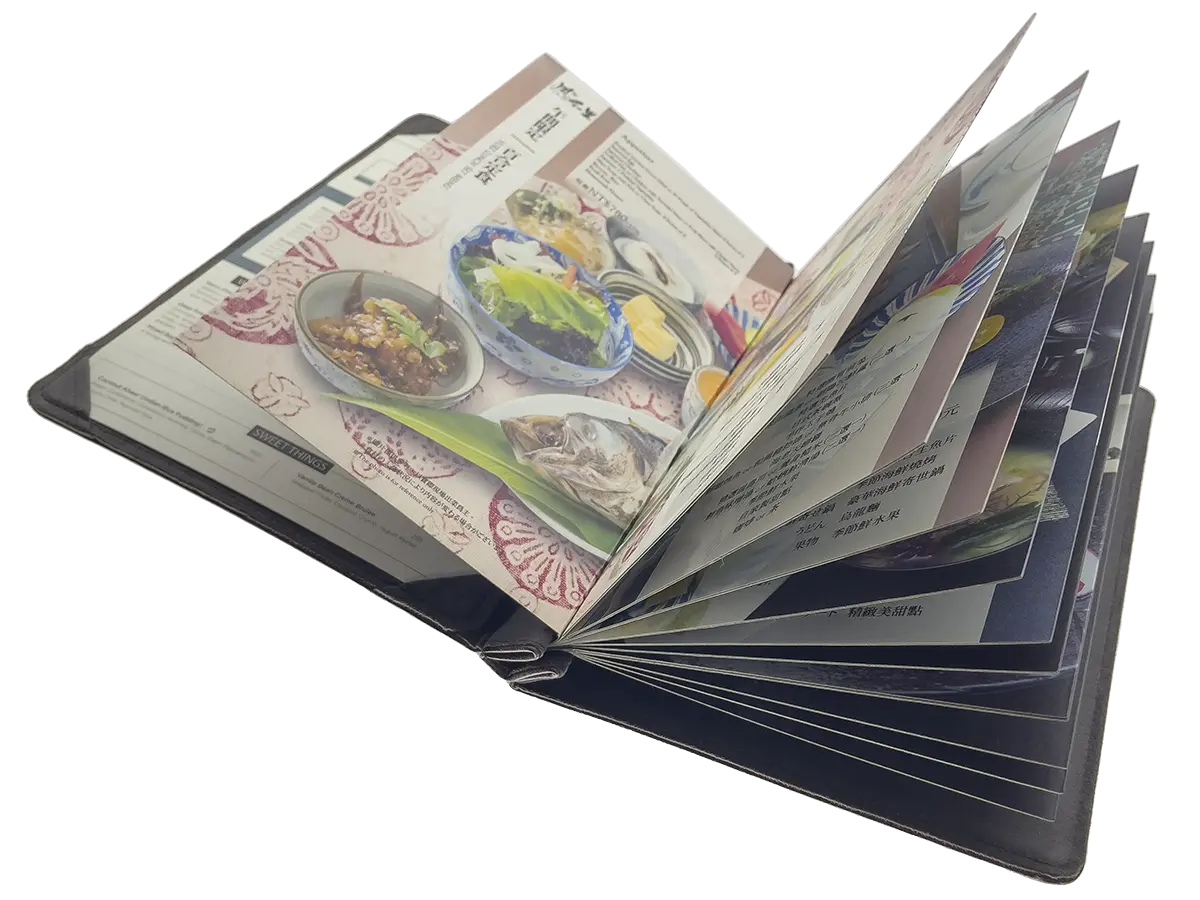
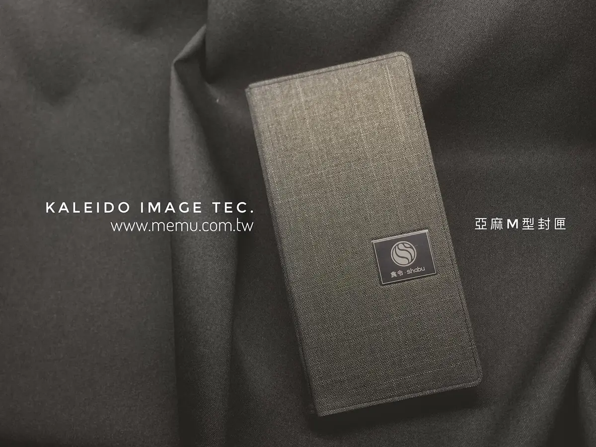
The double-fold binding of interior pages is considered a more upscale binding method. It utilizes an M-shaped binding, which is an integral and durable structure, particularly suitable for use with double-fold interior pages. The M-shaped binding’s bite presents a conical shape, allowing it to securely hold the interior pages, preventing them from coming loose. This type of spine has a width of 10mm, capable of accommodating a minimum of one sheet of paper and up to 24 pages, and you can adjust the spine width as needed, offering unlimited capacity adjustment.
When this binding method is paired with our exclusive double-fold cardstock interior pages, the design utilizes physical principles, making it easy to flip through even when more pages are added, without a rebound effect. The key feature of the double-fold cardstock interior pages is the absence of K-line creases, which reduces the risk of cracking or bursting. This binding method is well-suited for creating menus but should be avoided when designing covers, as it may conflict with the conical bite.

MENU second letter E.
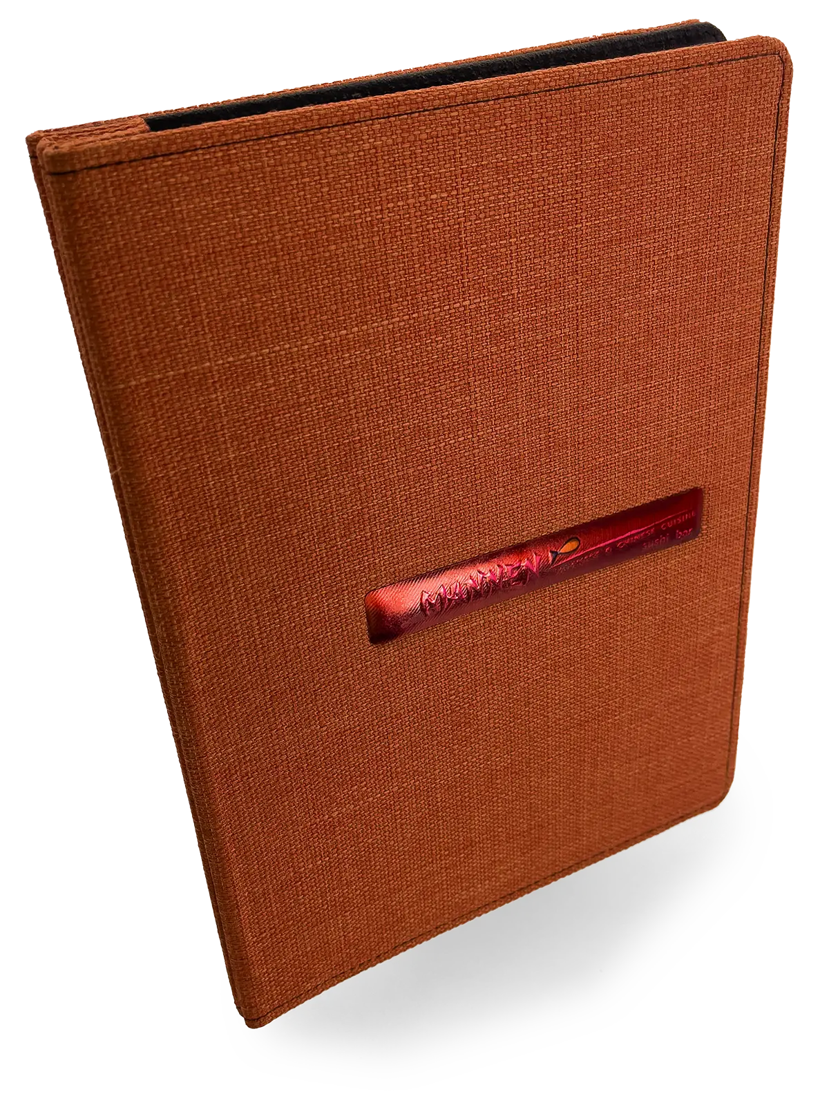
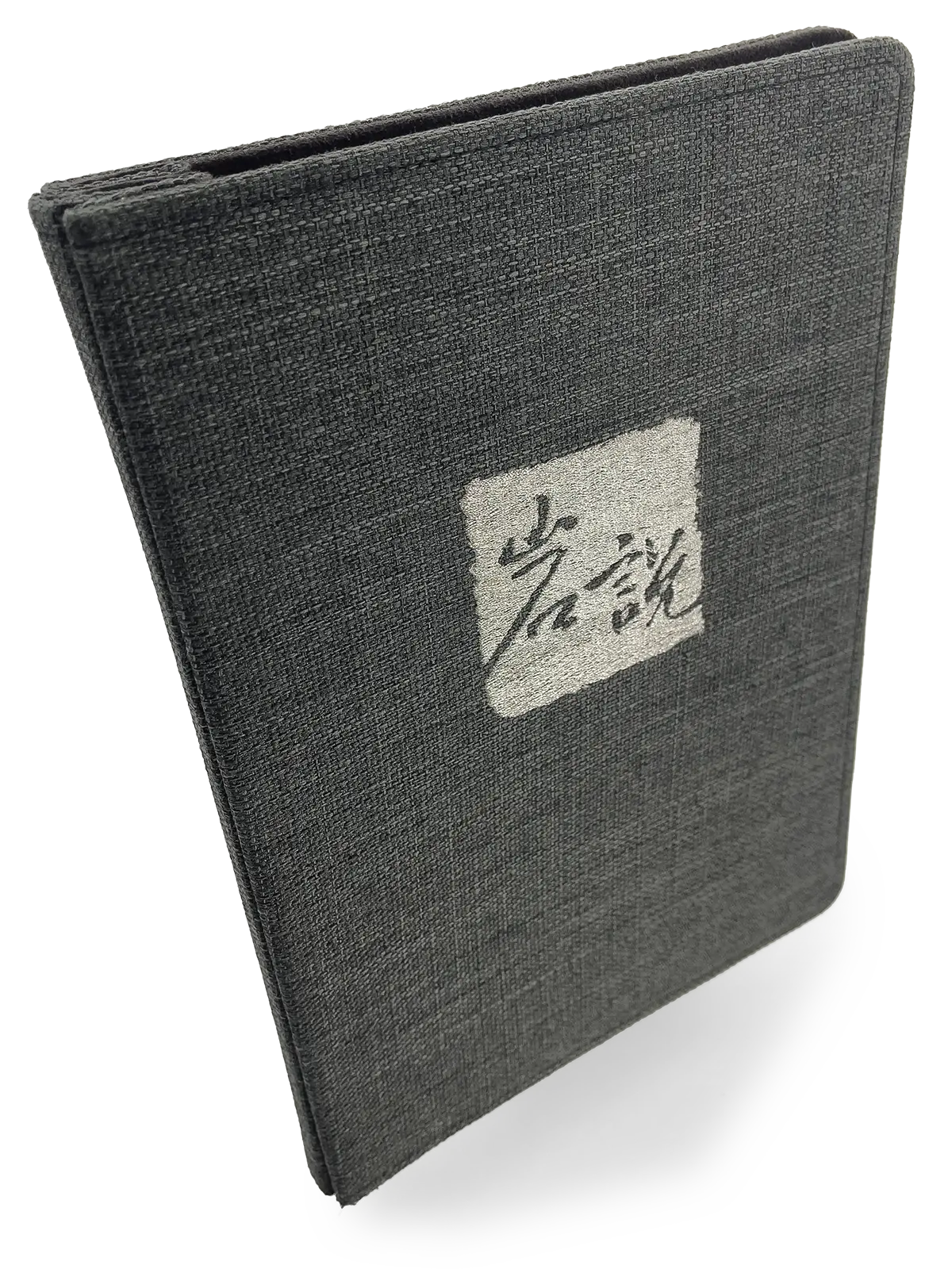
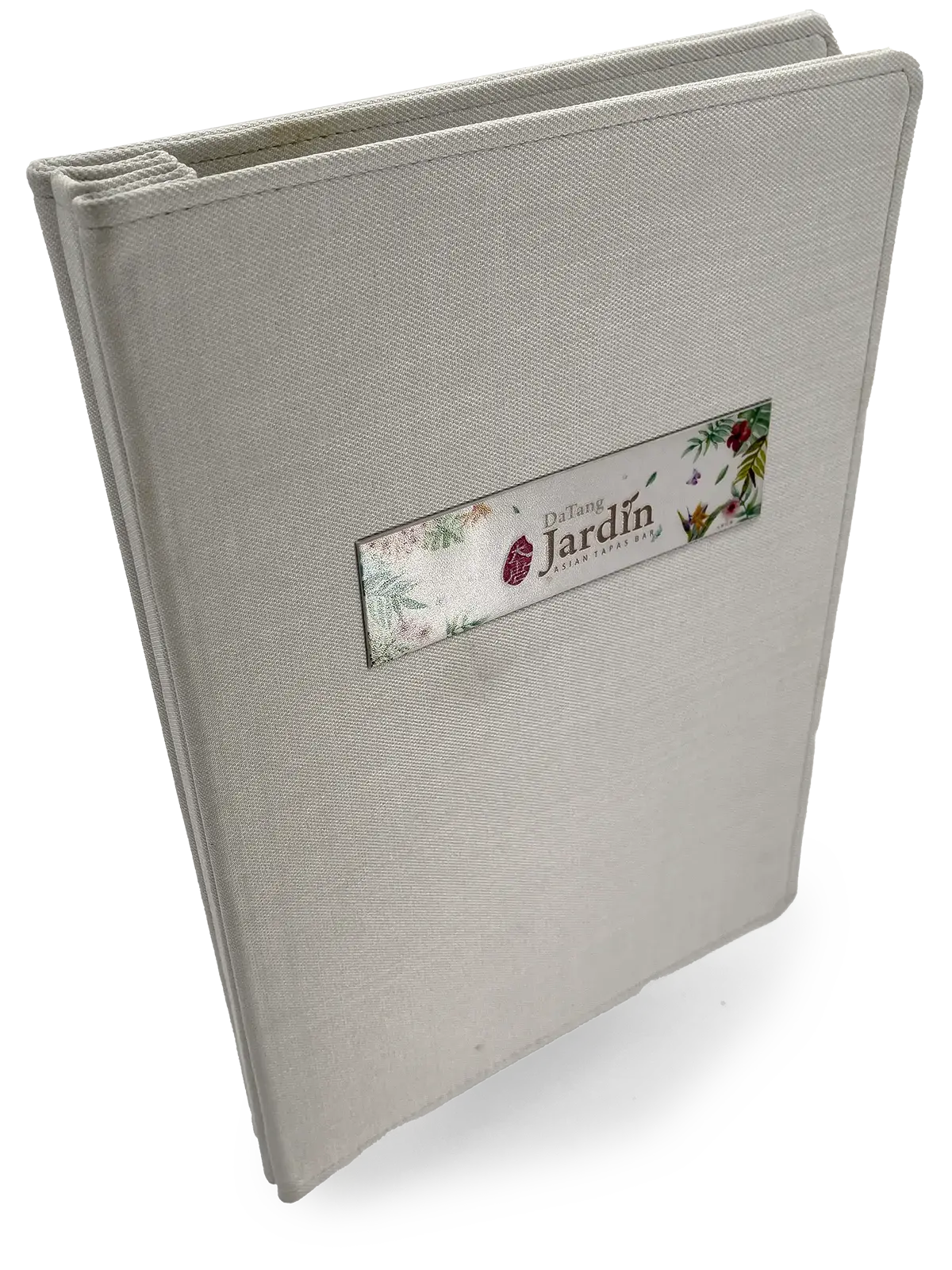
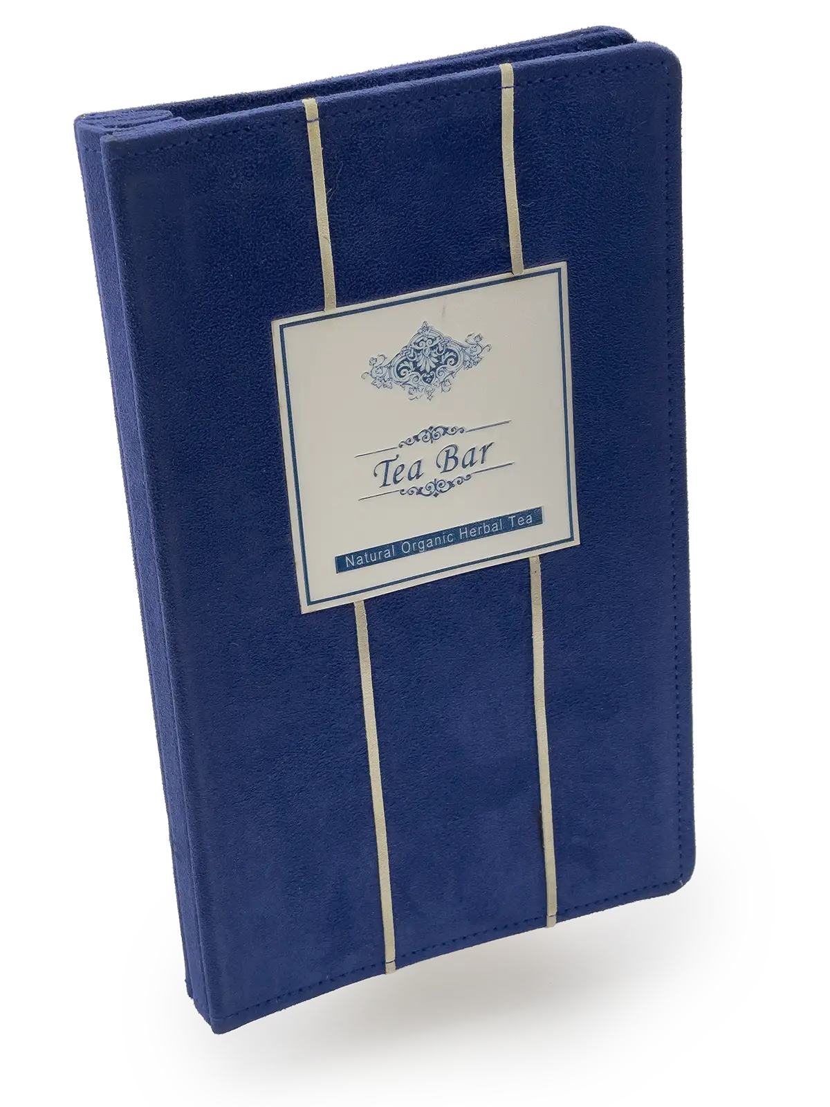
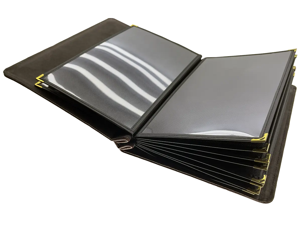
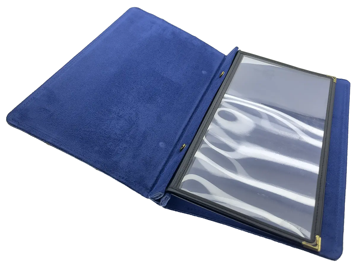
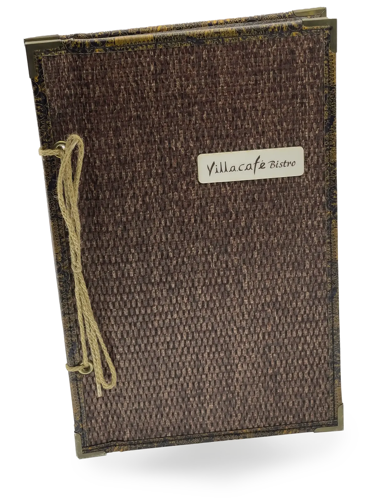
The MEMU™mini maker, also known as a “三明治菜單本” or “三明治封匣” (sandwich menu or sandwich folder), is technically an “E 型菜單本” or “E 型封匣” (E-type menu or E-type folder) with double-fold binding. This type of folder has a unique design featuring an upper and lower shell, with the interior pages placed in the middle, similar to the structure of a sandwich, hence the term “sandwich menu” used in this context. The menu format is named after the second letter “E” of “MENU.” The E-type binding typically involves binding on the left outer edge, using either string or screws, without the need for a spine. However, for aesthetic and decorative purposes, you can choose to add a decorative spine to embellish the binding section, making it more attractive. This design not only doesn’t affect the number of interior pages but is also highly flexible, accommodating various page counts, even up to ten thousand pages.
However, as the number of interior pages increases, flipping through them may become challenging, especially beyond 24 pages. To address this issue, our shop has exclusively developed cardstock interior pages or unbeatable menu interior pages. These interior pages have special materials and structures that ensure a smooth page-turning experience, even with a high page count, making flipping through them easy. This innovative design ensures high practicality and usability for the menu book, providing customers with an excellent user experience.
E-type menu folders with double-fold binding offer a variety of interior page options that can be adjusted based on the restaurant’s needs and budget. Here are several common interior page choices:
- Cardstock pages: For this type of page, it’s recommended to use bridge connectors. Cardstock provides a high-quality texture and durability, making it ideal for showcasing high-quality images and text descriptions. The key advantage is that it’s very easy to turn pages, providing a satisfying experience that keeps customers engaged.
- Art paper inner pages: Dreamy art paper typically features high-quality paper with a luxurious texture, making it ideal for menus that require an exceptionally refined and artistic design.
- Invincible menu inner page: Using special rigid PVC material, combined with environmentally friendly non-woven fabric, enhances the flexibility and durability of page-turning. The options of high gloss and diamond gloss make it suitable for long-term use in menu interior pages.
- American menu inside page: Utilizing special rigid PVC material, with options for high gloss and diamond gloss, these menu interior pages are a product of the 1940s, representing the pinnacle of high-end plastic material for menus.
- Inner pages color printed on ivory paper: Using 180-pound ivory paper for digital inkjet printing and illustrations, the surface can be coated with either gloss or matte finish. After the coating, it results in a thickness of approximately 220 pounds.
- PVC inner page rubber sleeve: Using flexible PVC material, processed through high-frequency heat treatment, with options for matte and glossy finishes.
Furthermore, there are more options for inner pages to meet different needs and budgets. However, due to the weight of some materials, it is recommended to keep the number of inner pages between approximately 8 and 24 to ensure that the menu does not become too heavy.
The E-type menu folder, with its unique sandwich structure and diverse inner page choices, has become the preferred choice for high-end restaurants. It exudes a sense of high quality and adds value to the dining experience. The various inner page options provide flexibility for customization according to the restaurant’s needs. While the bookbinding may be visible on the inner pages, decorative bookbinding can also be chosen for aesthetic and decorative effects. This menu format has a unique charm in attracting customers and enhancing the brand image. Through the design and innovation of this menu, restaurants can offer a superior dining experience to their customers.
Image link:Herbal Weaving Menu #05:
VC Plywood MENU #07:
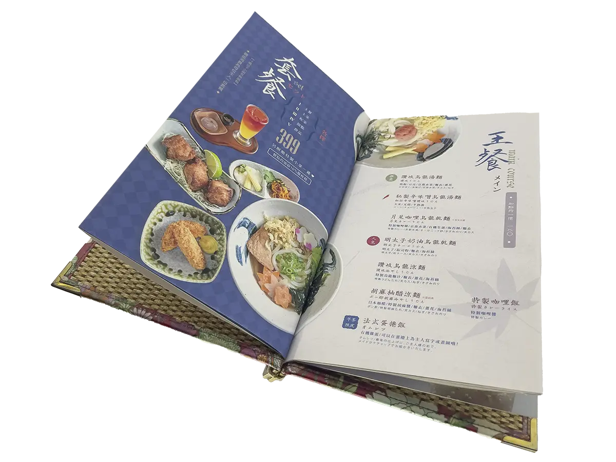
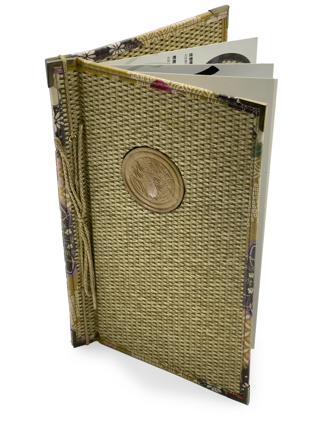
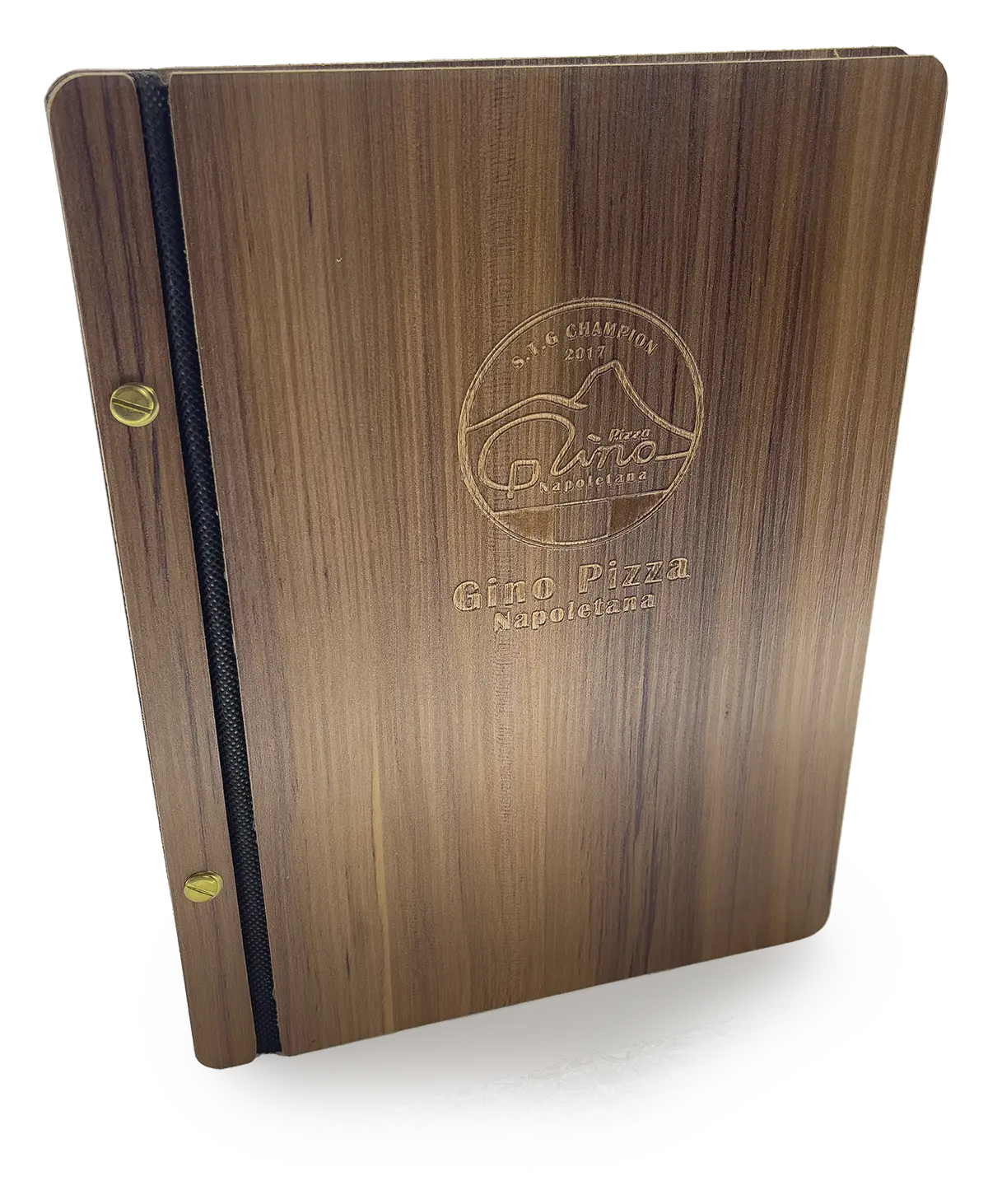
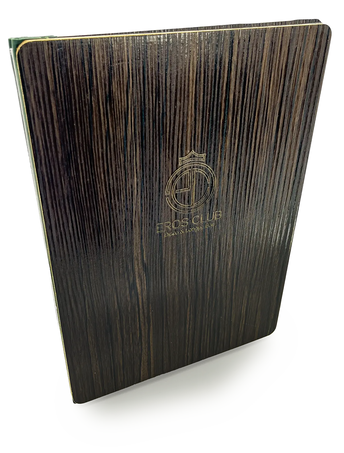
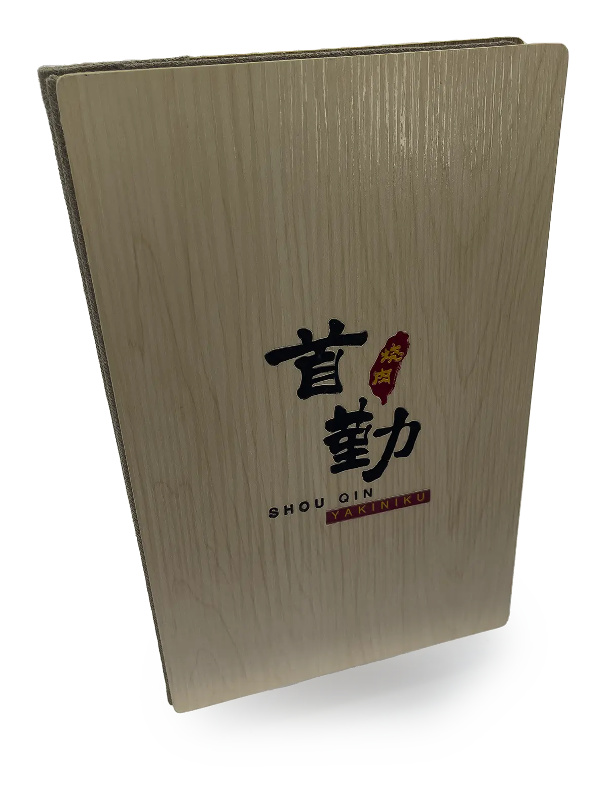
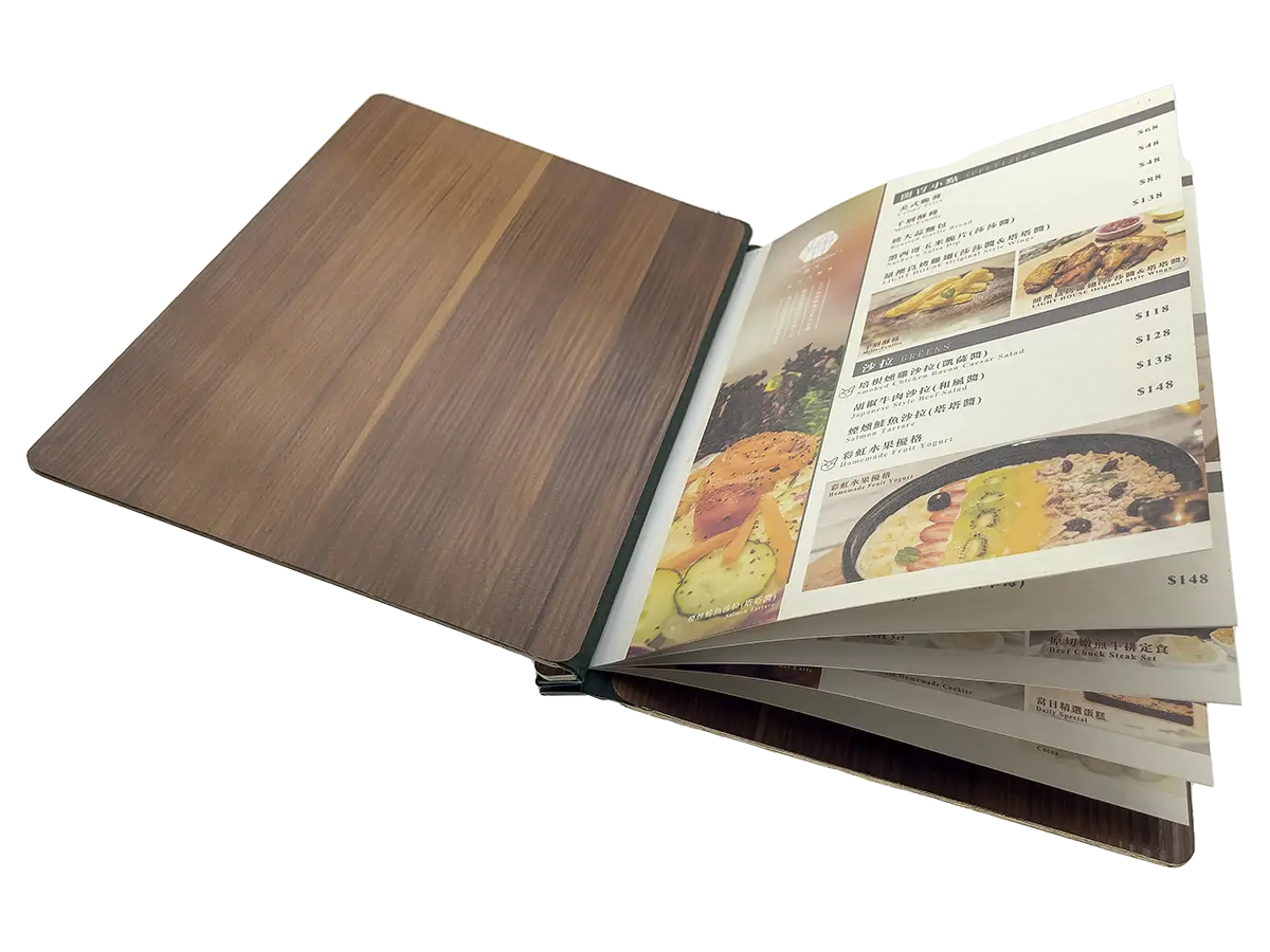
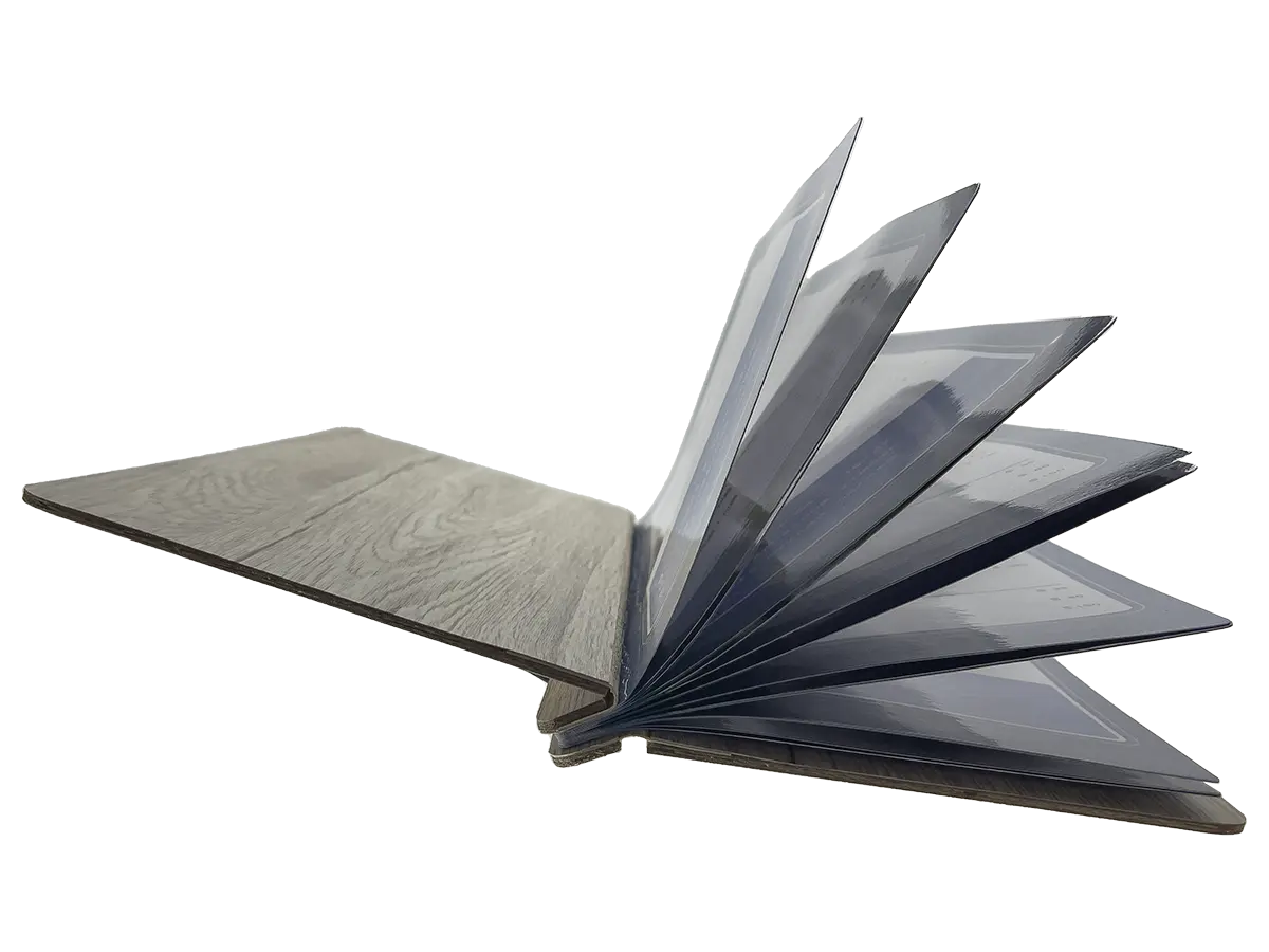
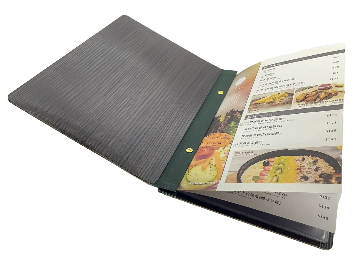
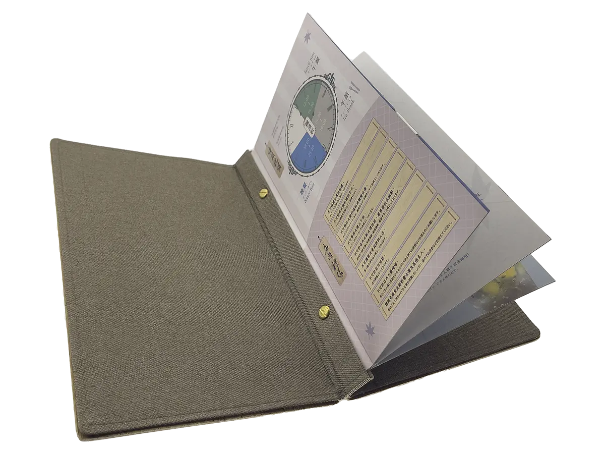
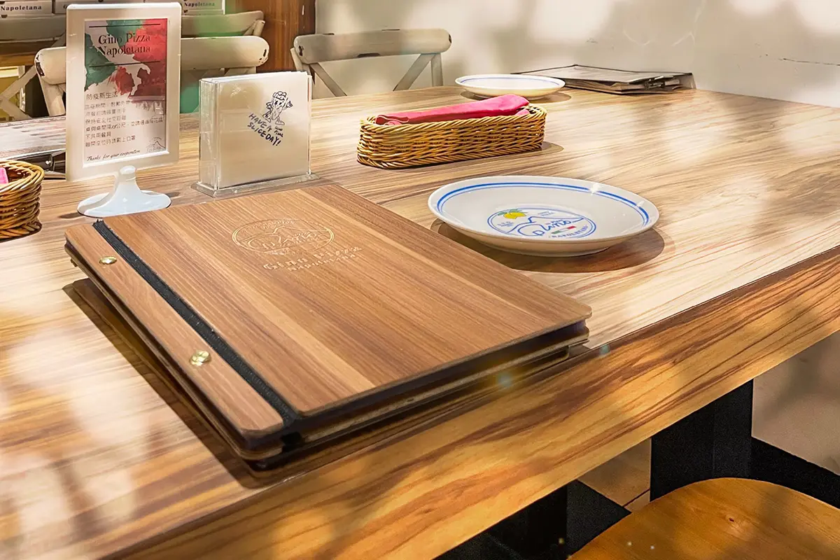 The inner pages can only be bound in double multiples. You can interchange the binding position, creating different forms or variations. When bound inside, it will resemble an M-type box with a triangular bite, while when bound outside, it will have a flat appearance, resembling a sandwich, also known as a sandwich box. Using this for a wine menu might result in irregularities, so it’s advisable not to opt for the E-type if you want an unconventional wine menu. When used as a cover, it can be transformed into an N-type and, with the addition of creative bookbinding, can become a U-type, supporting quadruple binding.
MENU third letter N.
The term 手摺子 refers to a foldable menu, which is named for its unique N-fold method. It is commonly known by various names such as 彈簧摺、觀音摺、雙摺、包摺、三摺 among others. These diverse descriptors stem from different features of the hand-folded menu. While these terms may not be widely accepted in professional terminology, they are well-known in everyday language.
The number of pages in a hand-folded menu increases with the number of folds, and the more pages there are, the more complex the folding becomes. Therefore, it is generally recommended that each hand-folded menu contains 6 to 8 pages of content.
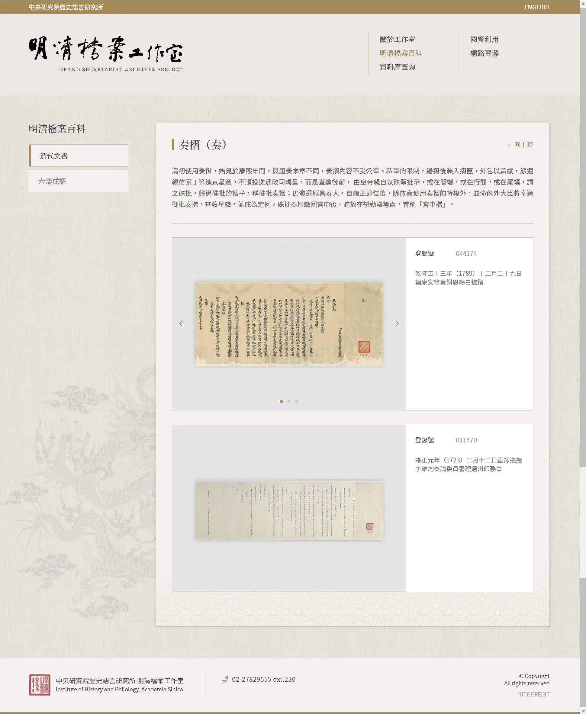
Someone once published a claim on a well-known encyclopedia website regarding the origin of 手摺子 suggesting it originated in ancient China and was used as sheepskin documents for diplomatic passage. However, this claim was quickly questioned and deleted due to internal inconsistencies and a lack of solid supporting evidence. The form and purpose of hand-folded menus are significantly different from those of sheepskin documents, and they have distinct applications in real life and theater, thus not supporting the theory that they originated in China.
On the contrary, 聖旨奉摺 (imperial edict folding) is a type of official document in hand-folded menu format specifically used for official purposes. Hand-folded menus, on the other hand, are a widely popular folding style in the folk tradition. Therefore, one cannot simply conclude that they originated in China based on this fact. An alternative perspective suggests that in historical documents such as those related to great voyages, hand-folded menus were used for folding entire world maps. This example indicates that hand-folded menus had become common everyday items with widespread applications, including in map-making. However, their exact origin remains difficult to determine.
Data reference:奏摺明清檔案工作室 Crand Secretariat Archives Project
The binding of the N-type menu is unique, and the choice of inner pages is limited by its structure. It can be adjusted according to the restaurant’s needs and budget. Here are several common inner page choices:
- Art Paper Inner Pages: Art paper, known for its high-quality texture, is suitable for creating menu inner pages that require a dreamy and exquisite design.
- Ivory Paper Color-Printed Inner Pages: Using 180-pound ivory paper for digital inkjet color printing, the surface can be coated with either a glossy or matte finish, resulting in a thickness of approximately 220 pounds after lamination.
In addition, the MEMU™mini maker has introduced new design improvements for the N-type menu folder and can support all types of inner page binding, eliminating the need for limited folding practices.
Image link:Hinoki MENU #06:
VC Plywood MENU #07:
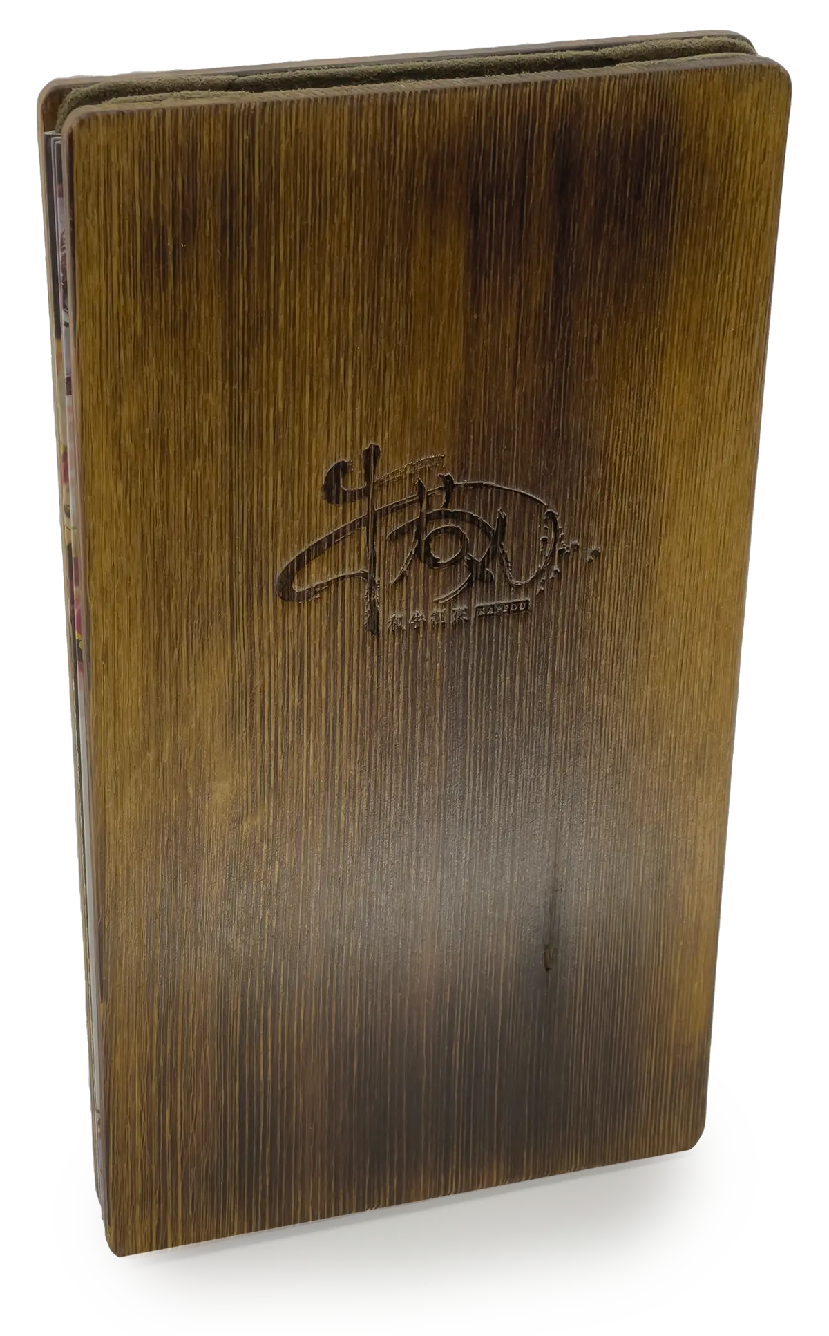
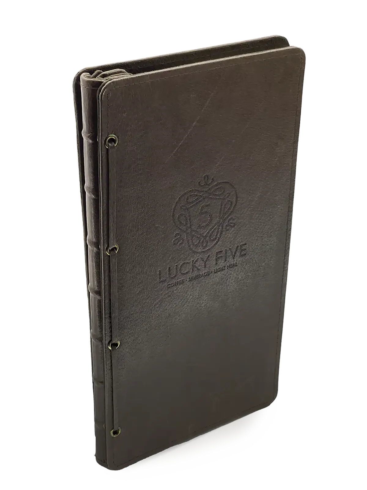
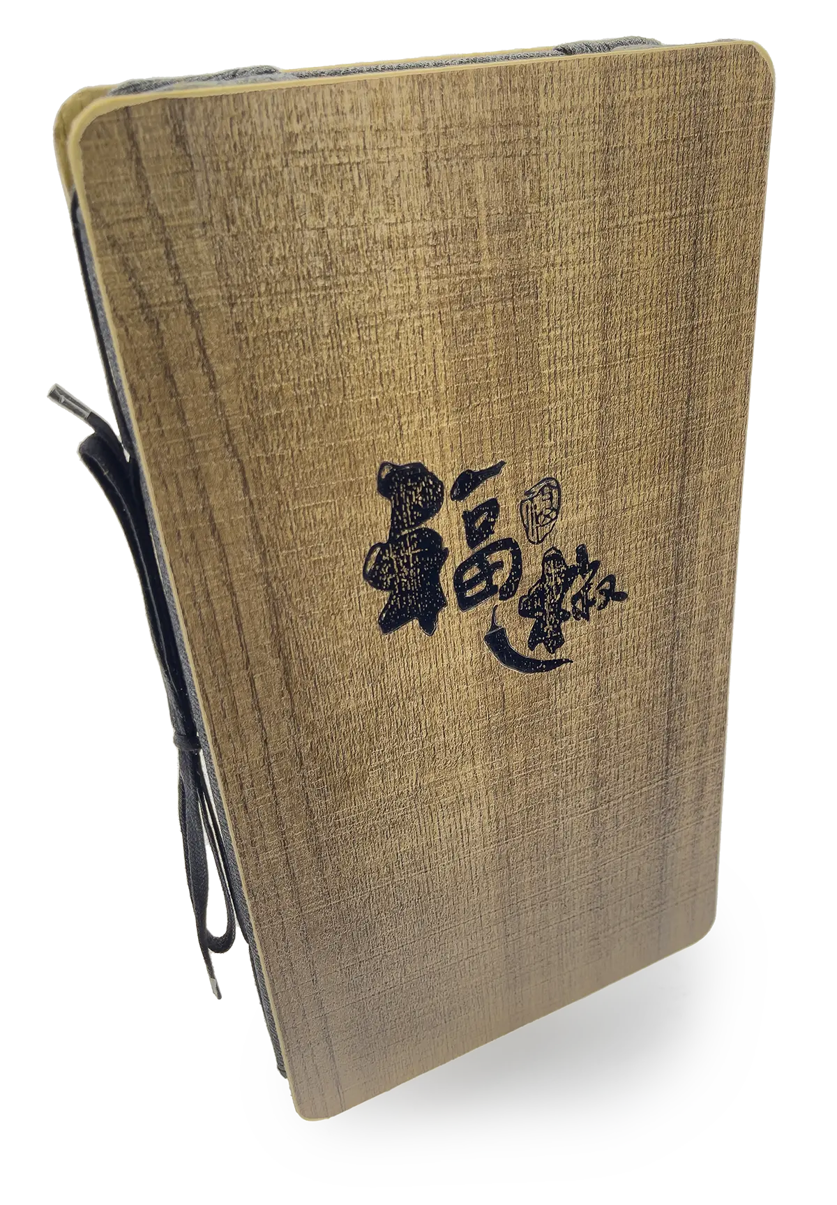
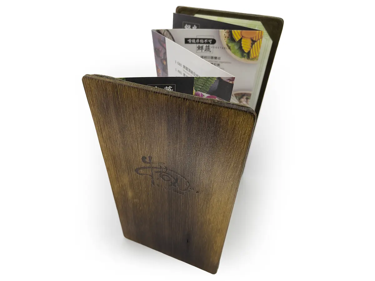
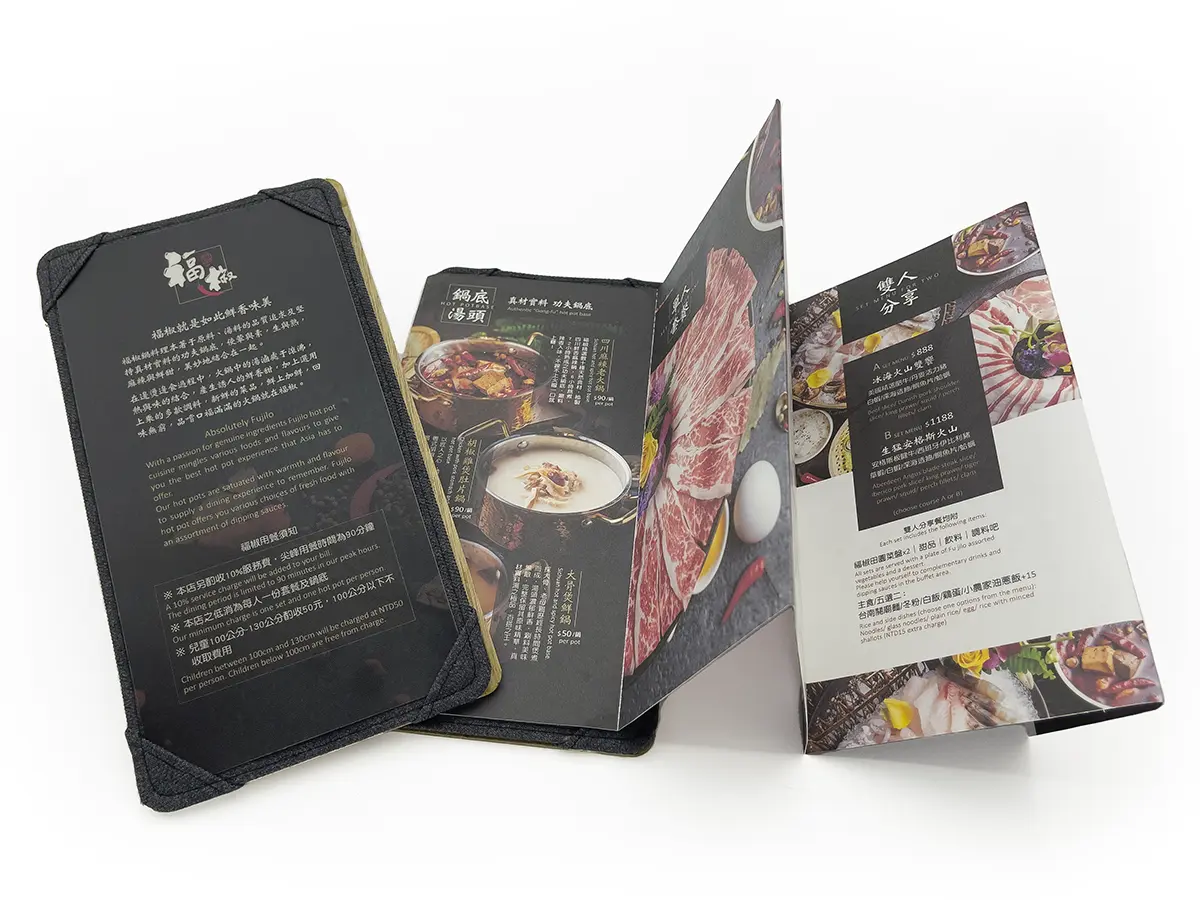
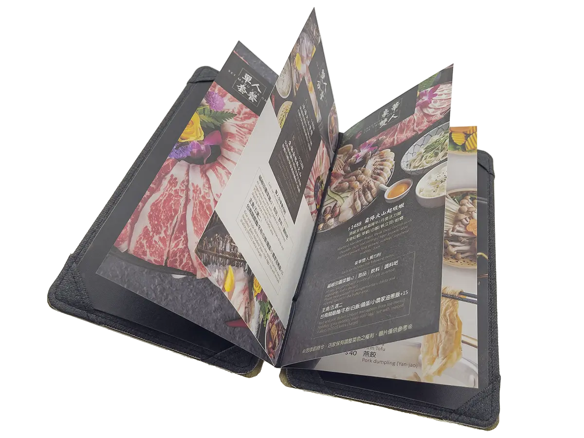
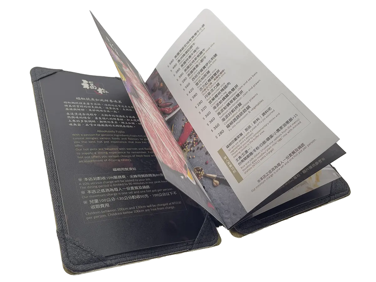
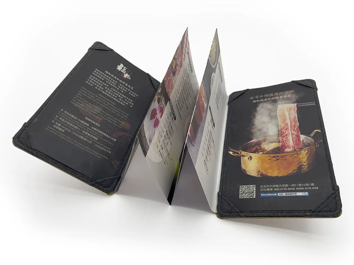 The simplest and most complex, folding a single A3 paper in two creates the basic version of the N-type folding fan. By crafting a cover from two pieces of wood and then folding an A3 paper into three or four sections, you have the luxurious N-type folding fan. Just like other designs, the N-type can be made as a fixed or loose-leaf style. Adding creative bookbinding to the N-type turns it into a U-type, supporting quadruple-page binding. Only our shop can truly maximize the potential of the N-type.
MENU fourth letter U.
The U-type single-folder menu box is a common and basic design for quadruple-page binding menus. The binding method for this type of menu box is typically on the side of the book spine. It offers various binding components and structural options, including strings, screws, elastic cords, metal clips, covers, file rods, wine lists, metal rings, rubber bands, iron rings, U-clips, atomic clips, etc., making it highly versatile.
One of the key features of the U-type menu book is that its page count can be adjusted according to the specific requirements, with a maximum of around 320 pages. However, it’s generally recommended to keep each menu between 8 to 24 pages to ensure user convenience and ease of page turning, even when there are more pages.
The U-type menu box with quadruple-page binding offers a variety of page options that can be adjusted according to the restaurant’s needs and budget. Here are some common page choices:
- Cardstock pages:Cardstock interior pages typically offer excellent texture and increased durability, making them well-suited for showcasing high-quality images and text descriptions. One key advantage is that they provide a satisfying page-turning experience, leaving you with a feeling that you won’t want to go back to any other option. Cardstock pages can provide menus with a premium and tactile feel, ultimately enhancing the overall dining experience.
- Art paper inner pages: Dreamy art paper typically features high-quality paper with a luxurious texture, making it ideal for menus that require an exceptionally refined and artistic design.
- Invincible menu inner page: Using special rigid PVC material, combined with environmentally friendly non-woven fabric, enhances the flexibility and durability of page-turning. The options of high gloss and diamond gloss make it suitable for long-term use in menu interior pages.
- American menu inside page: Utilizing special rigid PVC material, with options for high gloss and diamond gloss, these menu interior pages are a product of the 1940s, representing the pinnacle of high-end plastic material for menus.
- Inner pages color printed on ivory paper: Using 180-pound ivory paper for digital inkjet printing and illustrations, the surface can be coated with either gloss or matte finish. After the coating, it results in a thickness of approximately 220 pounds.
- PVC inner page rubber sleeve: Using flexible PVC material, processed through high-frequency heat treatment, with options for matte and glossy finishes.
Additionally, there are more page options available to meet various needs and budgets. However, due to the weight of some materials, it’s recommended to keep the page count between approximately 8 to 24 pages to ensure the menu book doesn’t become too heavy.
The U-type menu book, also known as a U-type menu box, is one of the most widely used menu binding styles. It is typically bound in quadruple pages, allowing the entire menu to lie flat and be easily opened without any blind spots, making reading and page-turning more convenient. Furthermore, bridge connectors can be used to bind the menu in a way that transitions from quadruple pages to double pages, providing flexibility in binding. This versatile binding method has made U-type menu books highly popular and suitable for a wide range of occasions.
Image link:U-shaped MENU #02b:
U-shaped MENU #04b:
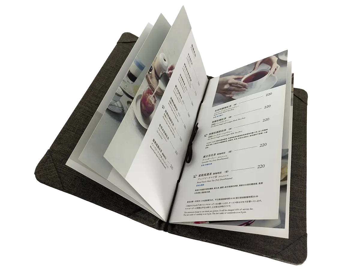
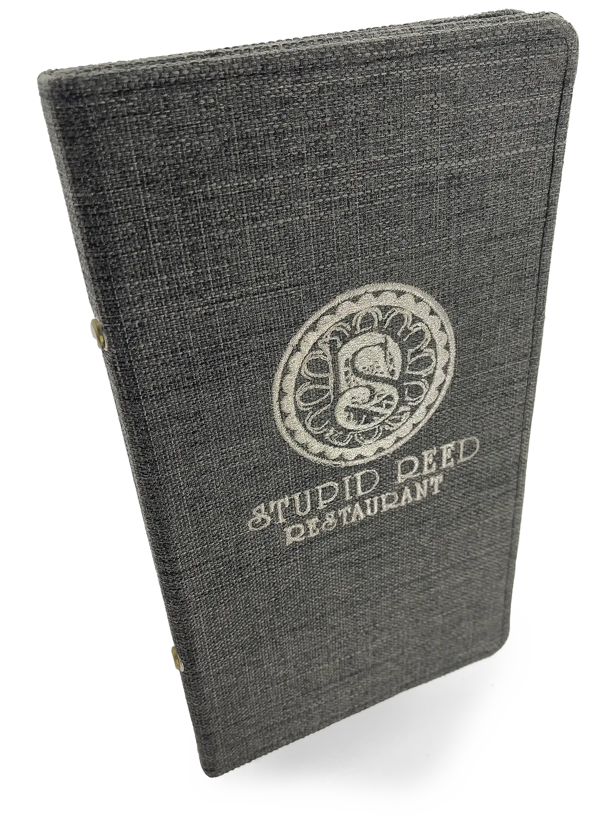
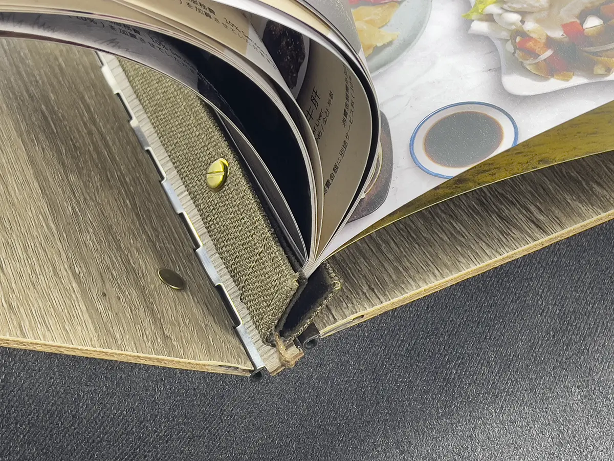
The U-type menu book, which is the most widely accepted and common style, offers the greatest variety. It boasts the highest reliability and durability, and while it may have a standard appearance, it is also the most aesthetically pleasing. It can be used to create menu boxes, covers, and wine lists, making it a versatile and popular choice.
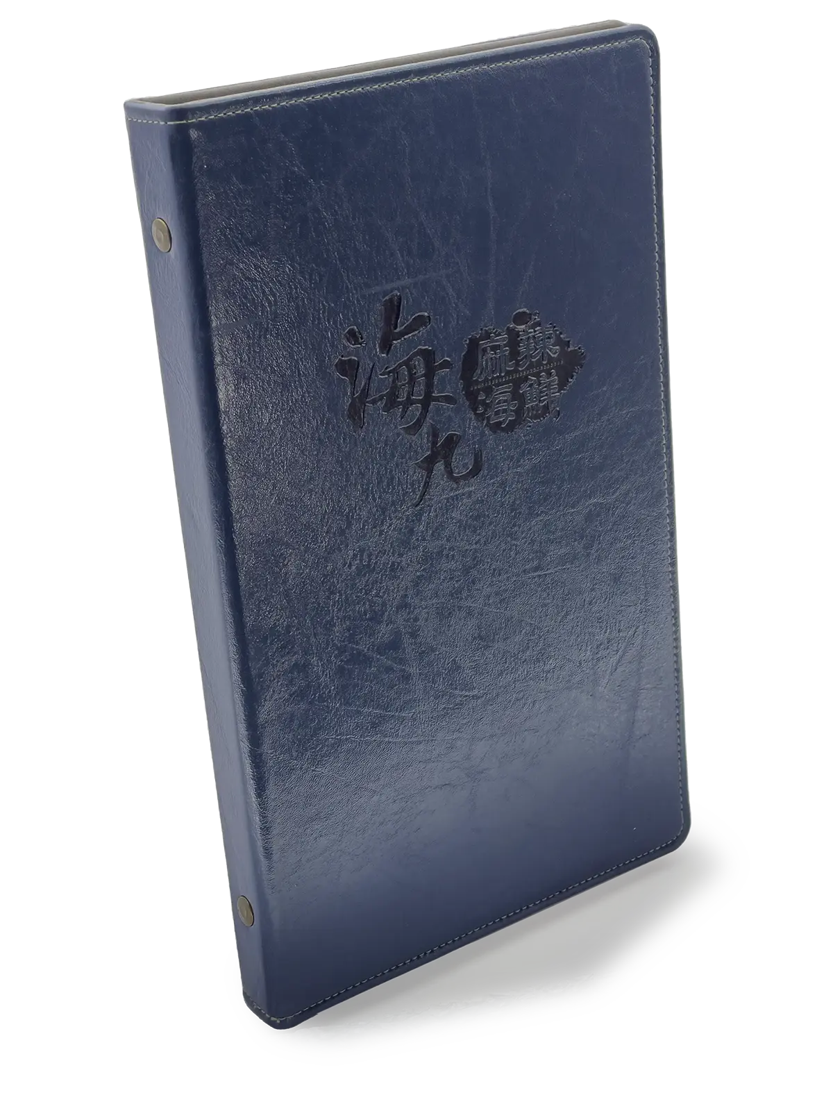
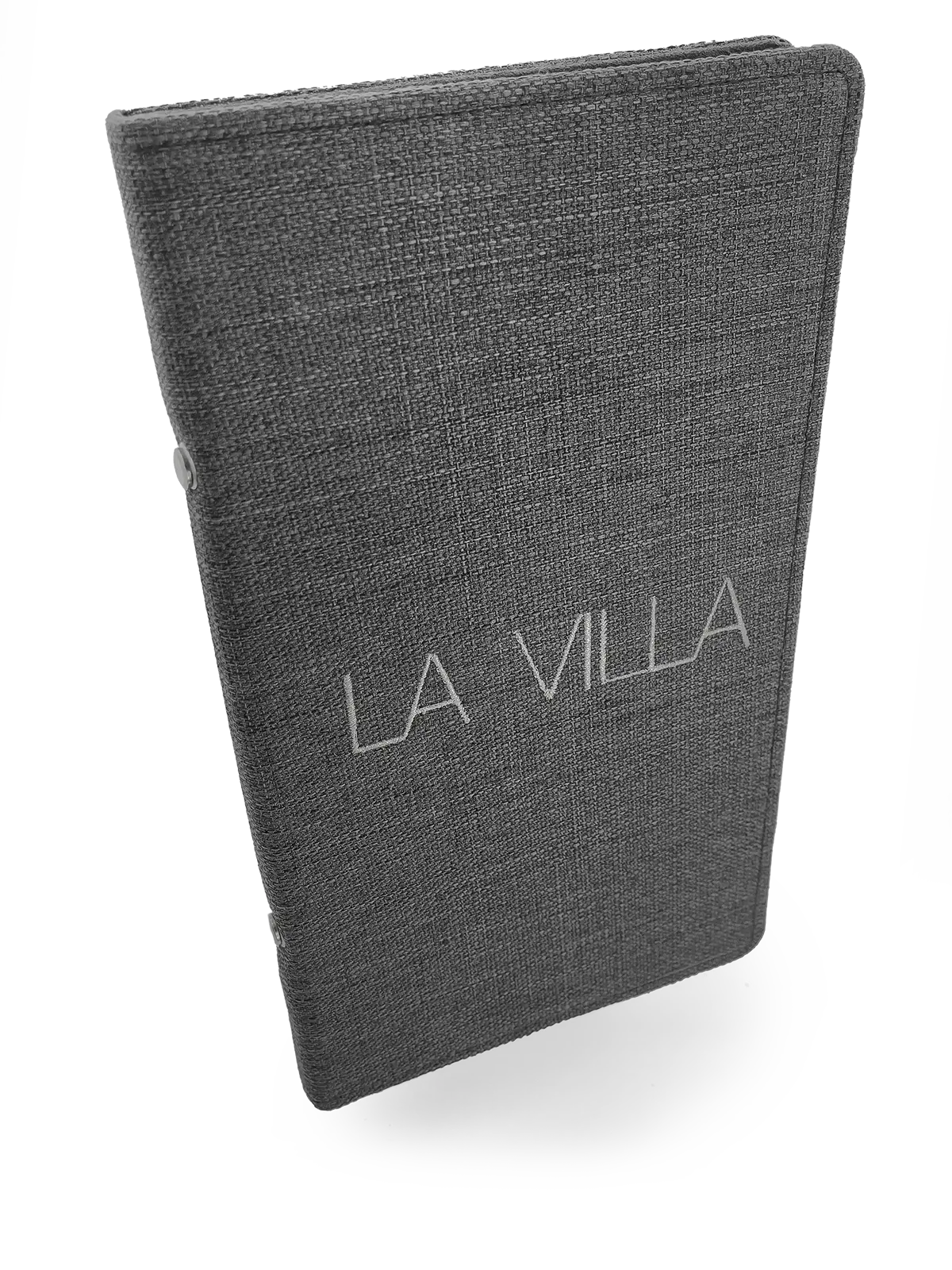
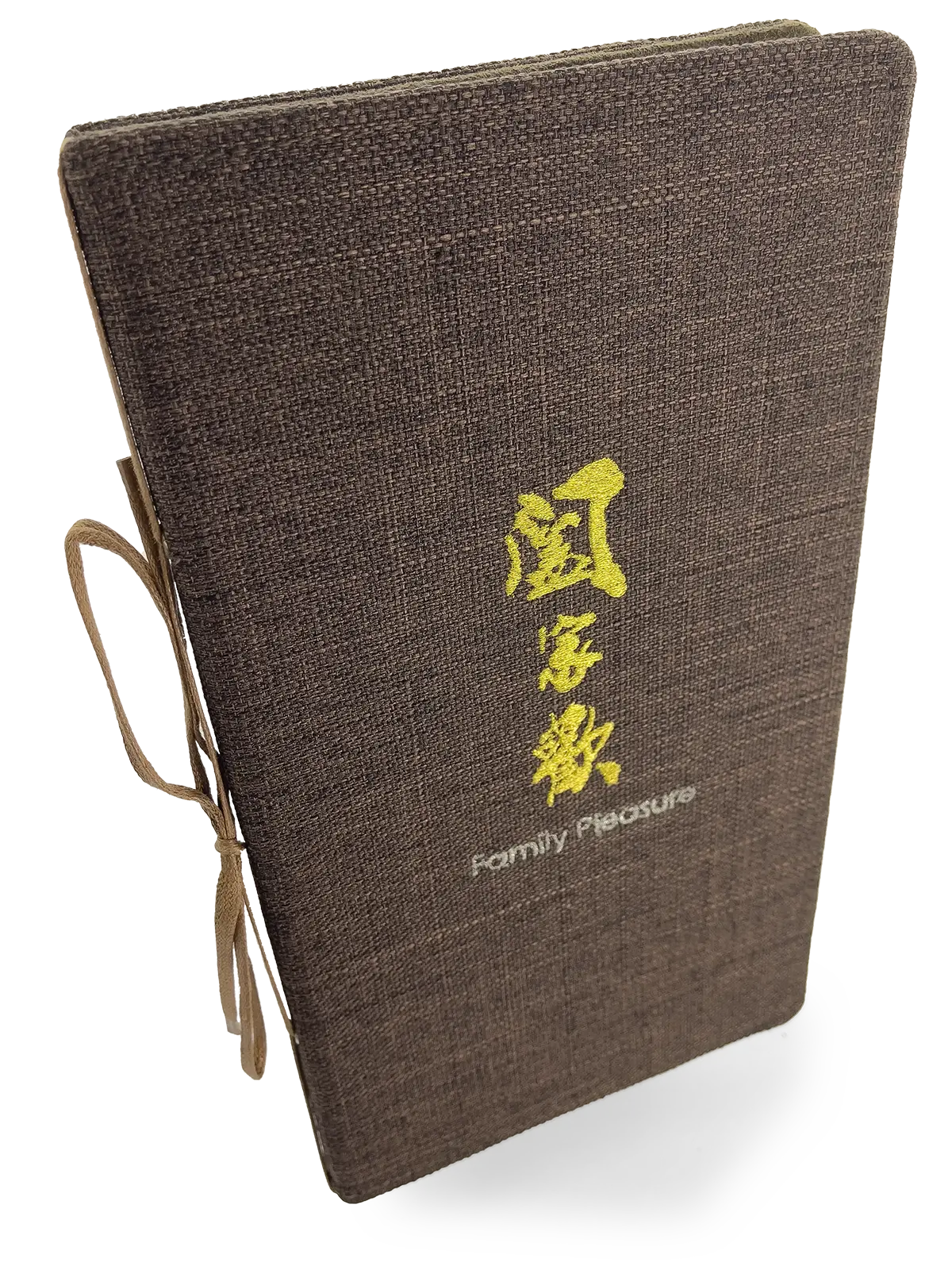
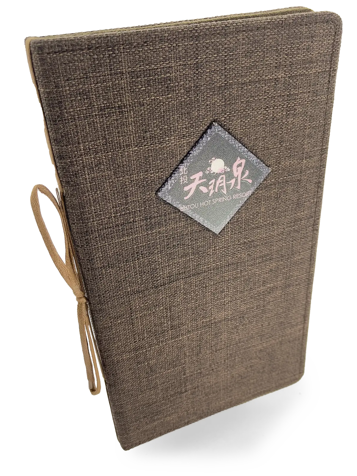
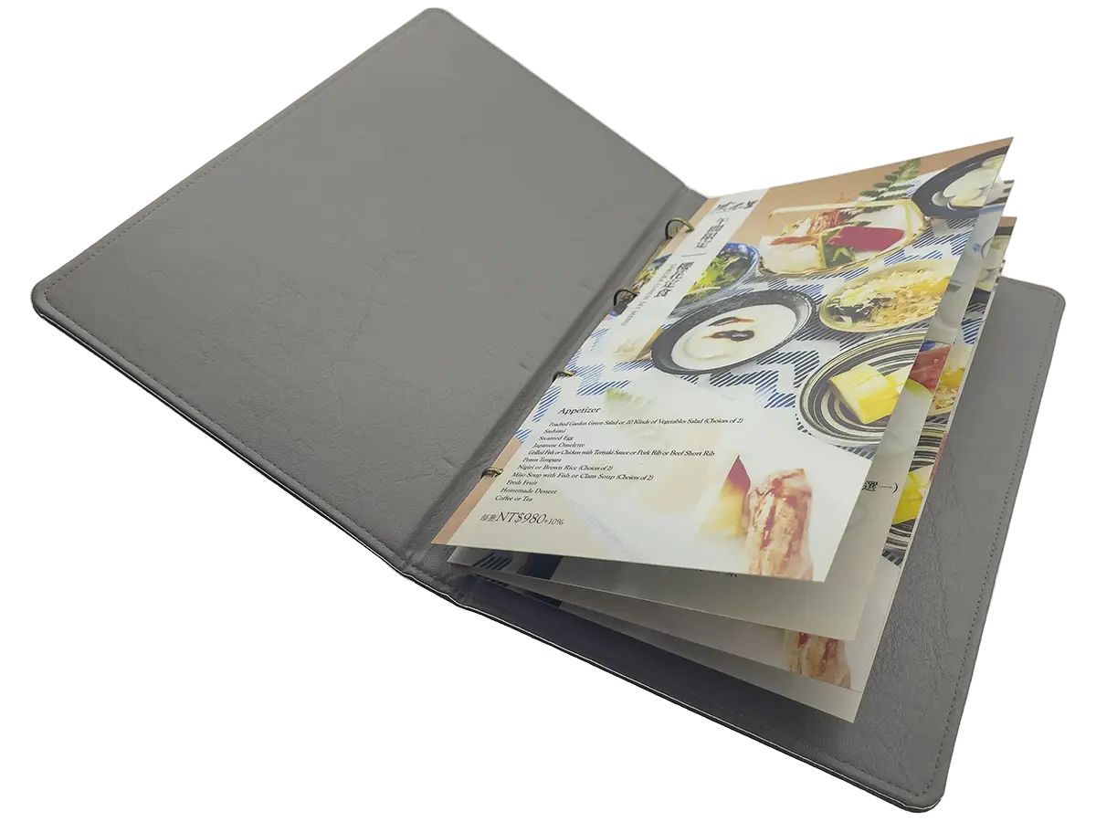
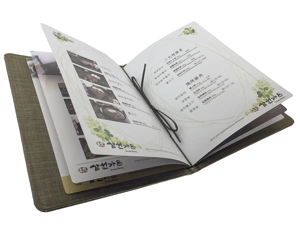
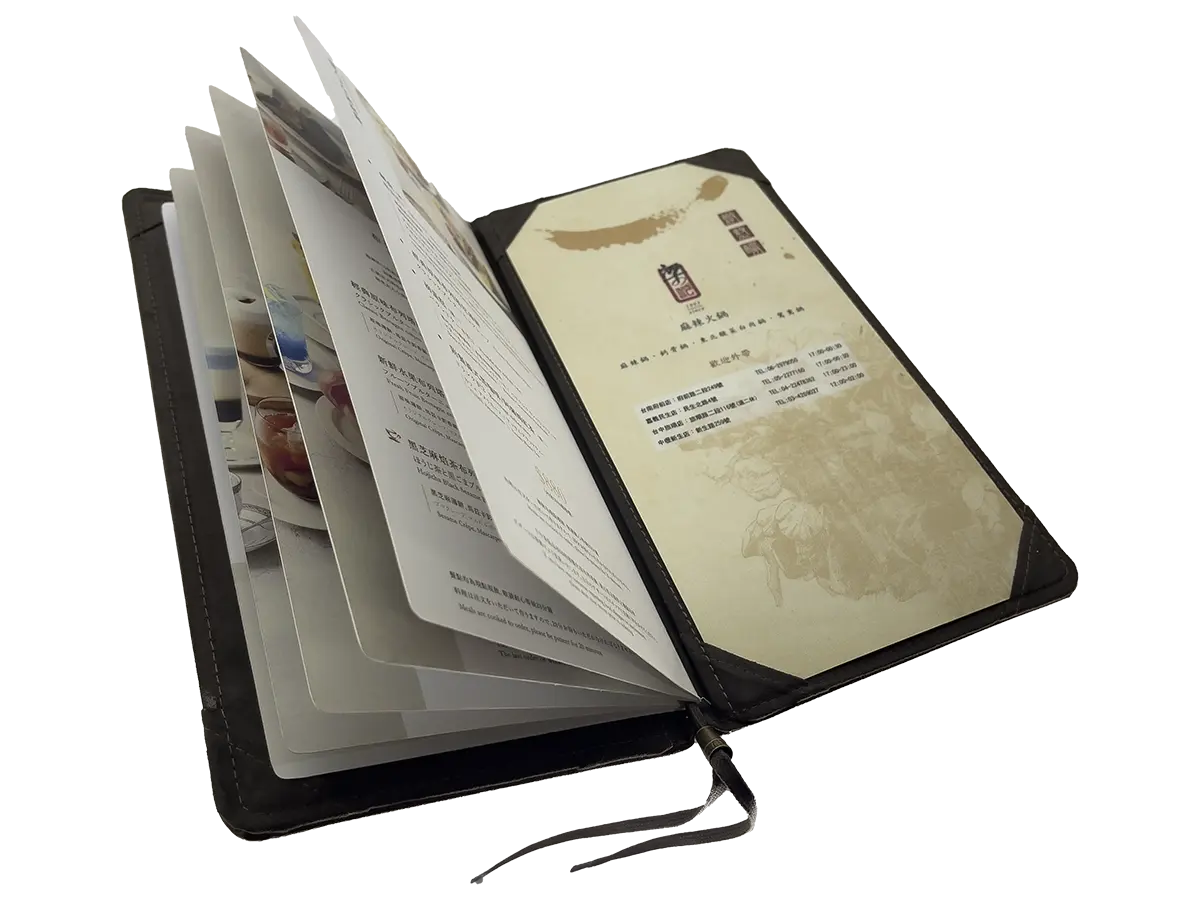
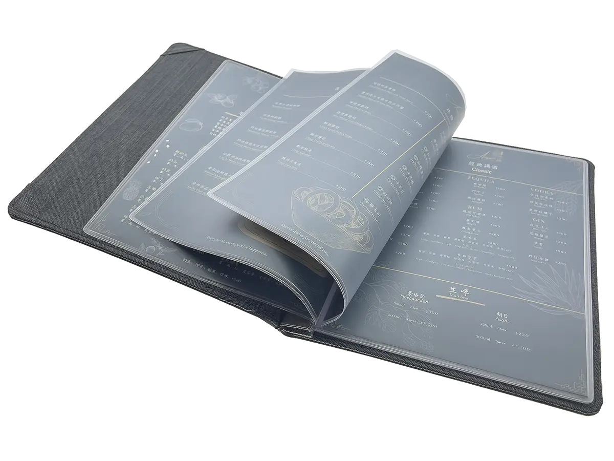
The U-type double-page wine menu box features a design with only double-page layouts. On the other hand, the U-type multi-page wine menu cover is equipped with a quick-change system for double-page, four-dimensional pocket inserts, making inner page replacement extremely swift and convenient. The interior of the cover is crafted from synthetic suede fabric, ensuring comfort and durability. For the U-type multi-page wine menu cover, a design with 2 to 6 pages is the most suitable.
The U-type double-page wine menu box features a design without a book spine and can be used in combination with paper pages. It is recommended to use 8-ounce cardstock inserts. The interior of the cover is made with a combination of synthetic leather and synthetic suede fabric, providing both comfort and durability. This double-page wine menu is particularly suitable for formal occasions like contracts and memoranda. Moreover, it allows for quick page replacement. The wine menu’s four-dimensional pockets should have 8-ounce cardstock inserts to secure the pages and prevent them from falling out. Double-sided cardstock pages are suitable for easily and conveniently changing the menu content for different dining periods. As for maintenance, it can be wiped clean with water without the need for electricity.
When expanding to a multi-page wine menu cover, it’s recommended to choose between 6 to 10 pages at most to avoid affecting usability. Overall, the U-type multi-page wine menu cover is an excellent product with a fine design and high quality, deserving praise and recommendation.
Notice: Multi-page menus are often referred to as “book covers” or simply “covers.” The padded interior of covers can sometimes appear slightly inflated, which some people may not prefer. Covers and cases have no visual difference, only varying in their binding methods. Multi-page menus are made with the intent of protecting the binding of the inner pages of a book, and they typically include a cover and an inner lining. The cover serves as the external packaging of the menu and is usually made from materials like paper, cardboard, leather, or other options. It provides protection to the internal content while also adding style and taste to the menu.
The inner lining is a layer of material inside the cover that helps safeguard the internal content from damage, such as tearing or staining. In some cases, the inner lining might appear slightly inflated, which some people may not prefer due to the uneven appearance.
Cases, on the other hand, have a very similar external appearance to covers but differ in their binding method. A case is a box-like outer shell, typically made from sturdy materials like cardboard or durable leather, used for protecting and storing menu or menu items. Unlike covers, cases do not require intricate stitching or tight binding for the pages and can be easily opened and closed.
In summary, both covers and cases serve as external packaging to protect and display menus or menu items. They have a similar external appearance but differ in their binding methods.

Summarize
Similar in nature, different in habits. From the perspective of visual style or type, even though they may seem similar, they actually have distinct characteristics and practices, as introduced in the previous section. In this section, we discuss vastly different characteristics and customs related to types.
The visual style of menus may vary depending on the region, restaurant, and cultural background, while the types are diverse and may even be categorized based on the characteristics of different dishes or beverages. However, despite the differences in appearance and types, the underlying purpose of a menu remains the same: to provide a platform for consumers to make choices, allowing them to select dishes and beverages according to their tastes and preferences.
However, menu customs can differ based on regions and cultures. For example, Chinese restaurant menus often emphasize the cultural aspect of banquets, while Western restaurant menus focus on the dining experience and customer satisfaction. Furthermore, some countries’ restaurants categorize menus into different price ranges such as appetizers, mains, and desserts, while others categorize dishes and beverages by different flavors and textures, making it easier for consumers to choose their preferred options.
In conclusion, although menus may have different visual styles and types, they have their unique customs and styles in different cultures and regions.
In summary, it’s worth emphasizing that the term「菜單」or「點菜單」and「菜牌」is actually a specific term used in Taiwan. The word MENU originated from French and has a history dating back further than what we commonly know. The combination of these four letters in MENU is not random; it has its origins and historical significance.
客來多手創菜單本舖
Brand:MEMU™mini maker
Author:洪莉綺 ![]()
Director:洪忠 ![]()
CEO:蔡羽惠 ![]()

The information is for verification, please pay attention to the Taiwan service time difference
Weekday service hours:
Morning AM09:00~12:00 Afternoon PM01:30~06:00
Please make an appointment for a visit

No.183, Yongle St., Xinzhuang Dist., New Taipei City 24245, (ROC)
Formosa Taiwan
TEL:+886 2 2279-5252

MEMU™ Facebook page
It may take 36 hours to reply due to Taiwan time difference, Facebook fan page does not have online transaction function, Do not provide quotation or anything about money, Only for technical assistance or answer questions after transaction.

LINE Official Account
You can contact us through LINE app, it may take 36 hours to reply due to Taiwan time difference, LINE has MEMU store, welcome to visit and buy, directly click or scan QR Code with LINE app on your phone to enter the conversation.

